Why we need to stop coal exports and keep coal in the ground

Many observers have been heartened by the increase in natural gas production, which has contributed to significant significant declines in US greenhouse gas emissions.   It is not actually the most important factor reducing emissions in the first half of 2012, as my friends at CO2 Scorecard and I showed earlier this year.  And the methane emissions from fracking haven’t been measured very accurately, so there may be increased warming from methane that significantly offsets the reductions in other fossil fuels from the use of natural gas.

Another important issue addressed in the research note from CO2 Scorecard is the reduced price of natural gas resulting from fracking, which increases use of natural gas not just in the electricity sector (where gas displaces coal) but also in buildings and industrial sectors, and those increases offset emissions savings in the electricity sector.

Today there’s a story in the Guardian that shows another interesting (and troubling) price-related effect of natural gas fracking:  as US coal use has declined, an increase in coal exports from the US has reduced global prices of coal.  That price decrease makes it harder for countries with modest natural gas reserves to reduce use of coal-fired electricity, as the Guardian story demonstrates.  The pressure is particularly intense in developing countries, which are often more price sensitive than developed countries.

This story makes a compelling case for reducing and ultimately stopping exports of US coal, in order to keep global coal prices higher than they otherwise would be.  In part, US subsidies to the coal industry are subsidizing exports and reducing world electricity prices, and that’s just perverse, but even without subsidies, we need to slow and soon stop coal exports.

We need to either develop ways to sequester carbon from coal burning or keep the coal in the ground.  Since the first option is being tested but is nowhere near implementation on a large scale, our only current option is not burning the coal.  So that means not approving additional coal export terminals, diligently enforcing existing environmental regulations, and eliminating subsidies for coal mining.  It makes absolutely no sense to export coal that we don’t burn in the US, because no matter where it is burned, it will contribute to warming just the same.

US coal in decline: New Brattle Group report on coal-fired power plant retirements

On October 1, 2012, the Brattle Group published an update to its 2010 numbers on coal-fired power plant retirements, and it “finds that 59,000 to 77,000 MW of coal plant capacity are likely to retire over the next five years, which is approximately 25,000 MW more than previously estimated”.

The news release for the study states

Since December 2010 when the prior estimates of potential coal plant retirements were released, both natural gas prices and the projected demand for power have decreased, and environmental rules have been finalized with less restrictive compliance requirements and deadlines than previously foreseen. These shifts in market and regulatory conditions have resulted in an acceleration in announced coal plant retirements. As of July 2012, about 30,000 MW of coal plants (roughly 10% of total U.S. coal capacity) had announced plans to retire by 2016.

The updated study takes into account the most recent market conditions and the shifting regulatory outlook facing coal plants. To reflect the remaining regulatory uncertainty, the authors developed both “strict” and “lenient” regulatory scenarios for required environmental control technology. About 59,000 MW will likely retire under lenient rules versus 77,000 MW under strict regulations. Final regulatory requirements are still unresolved, but the authors suspect they will be akin to the lenient scenario. The study highlights that retirement projections are even more sensitive to future market conditions than to regulations, particularly natural gas prices. Likely coal plant retirements drop to between 21,000 and 35,000 MW if natural gas prices increase by just $1.00/MMBtu relative to April 2012 forward prices. Similarly, projected coal plant retirements would increase to between 115,000 and 141,000 MW if natural gas prices were to decrease by $1.00/MMBtu.“

Coal will continue to decline in importance in the US in the medium term, and it isn’t principally because of environmental regulations.  Of course, regulations are getting tighter, but cheap natural gas is the main culprit.  In addition, few new coal plants are likely to be built to replace the retiring plants.  Instead, natural gas and wind plants will likely pick up most of the slack.

My Authors@Google talk on computing trends, now posted

I had great fun at Google on September 12th, 2012 talking about the implications of computing efficiency trends for mobile sensors, controls, and computing more generally.  This version contains my latest thinking and is my most polished version to date.  You can watch it below (or by clicking here).

My friend Luiz Barroso introduced me, and he was gracious enough to highlight my latest book, Cold Cash, Cool Climate:  Science-based Advice for Ecological Entrepreneurs.

For background on computing trends, see my Technology Review article, and the supporting academic article:    Koomey, Jonathan G., Stephen Berard, Marla Sanchez, and Henry Wong. 2011. “Implications of Historical Trends in The Electrical Efficiency of Computing."  IEEE Annals of the History of Computing.  vol. 33, no. 3. July-September. pp. 46-54.

I'm on KCRW today, talking about the NYT story and its implications

KCRW in Santa Monica, CA had a discussion show this morning (“To the Point”) about electricity used by data centers, prompted by the NY Times article by Jim Glanz.  Jim led off the show in discussions with the host (Warren Olney), and then I, Andrew Blum of Wired, and Andy Lawrence of 451 Group/Uptime Institute added context and commentary.  It was a useful discussion, and the interviewer asked good questions.  You can listen in here.

Giga Om on the NYT data center articles

Katie Fehrenbacher over at GigaOm did a service for those of us interested in data centers by compiling some of the issues with the recent New York Times article.  She summarizes her conclusions (with which I agree) here:

I feel the same way about the NYT’s series that I do about Greenpeace’s dirty cloud reports. Yeah, they got a few things wrong, but the overall thesis is right, and can be used to make the Internet industry even more conscientious about their carbon emissions and energy footprint.
There are still a few Internet leaders who haven’t publicly embraced energy efficiency and greener technologies for data centers. For example, Amazon and its web services haven’t really stepped up to touting energy efficiency and clean power technologies so far, despite its prominent role in the industry. Though, they have made some strides.
Additionally while the largest and leading Internet companies have widely adopted energy efficiency practices, businesses running their own IT services haven’t adopted these technologies. That’s one of the biggest problems with the article, that the reporter is lumping together businesses’ in house IT server practices, with the webscale cloud giants. But clearly there’s still a lot more work to be done when it comes to the Internet an its massive power consumption.

I applaud Jim Glanz of the NYT for shining a light on the need for greater energy efficiency in data centers, but feel strongly that tackling the problem will require critical insights that someone just reading that article would not pick up.  Let’s hope this is the beginning of a deeper conversation about these issues.

The NYT article on Power, Pollution, and the Internet: My initial comments

Jim Glanz, writing in the New York Times this past Sunday, described existing inefficiencies in Internet infrastructure, but omitted important context that can help interested readers really understand the problem.  The article, in which I’m quoted, is Glanz, James. 2012. “Power, Pollution, and the Internet.” New York Times.  New York, NY.  September 23. p. A1.   A related “Room for Debate” section (in which I have an article) went online on Monday September 24, 2012.

The article conflates different types of data centers, and in the process creates a misleading impression for readers who are not familiar with this industry.   I like to divide the industry into four kinds of data centers:  public cloud computing providers (like Amazon, Google, Facebook, and Microsoft), scientific computing centers (like those at national laboratories and universities), co-location facilities (which house servers owned by other companies), and what I call “in-house” data centers (which are facilities owned and operated by companies whose primary business is not computing).  The fourth category is by far the dominant one in terms of floor area and total electricity use, and almost all the issues raised in the article apply most clearly to facilities in that category.

Each category of data centers has very different characteristics and constraints.   The scientific computing category is in a class by itself, because it runs computing jobs than can be queued up and these facilities thus do not need to respond to changes in demand.  The other three categories must respond in real time, which requires some slack in the system in case of unanticipated changes in demand.  That’s why quoting the 96.4% utilization of LBNL’s supercomputer in July 2012 (as the article does) says nothing about possibilities for increased utilization in the vast majority of data centers.

The public cloud providers are much more efficient than the “in-house” and collocation facilities.  One implication of the NYT article (as expressed, for example, by quotes from Hank Seader and Randall Victora) is that we’ll be using the computing resources one way or another, and it doesn’t matter where these are housed.  This conclusion is incorrect.  The low utilization numbers cited in the NYT article generally apply to the “in-house” and collocation facilities, not to the cloud providers (who have many more and different kinds of users, so utilization is generally much higher).  The infrastructure efficiencies in cloud computing facilities are higher as well.  For example, the Power Utilization (or Usage) Effectiveness in typical “in-house” data centers is between 1.8 and 1.9, while for cloud facilities it is closer to 1.1 (that means for every 1 kWh used in IT equipment, only 0.1 kWh is used for cooling, fans, pumps, power distribution, and other infrastructure).  So it really matters whether IT resources exist in cloud computing data centers or in standard “in-house facilities”, and the problems identified in the article mainly matter in the “in-house” facilities.

There are good reasons why cloud providers are more efficient, including economies of scale, diversity and aggregation of users, flexibility of operations, and ease of sidestepping organizational constraints.  There is also an underlying driver for greater efficiency that is critically important–the cloud providers have fixed the internal institutional problems that lead to separate budgets for the IT and facilities departments (split incentives) and dispersed responsibility for data center design, construction, and operations.  The vast majority of “in-house” and collocation facilities have not fixed these problems, so efficiency is not high (or not even) on the priority list.  And it’s institutional and not technical failures (the lack of proper cost allocation, management responsibility, and inventory tracking) that results in a large number of “comatose” servers, for example.

The problem is that the people who run the data centers for “in-house” and collocated facilities have little influence on these institutional issues.  It’s the people at the C-level in the corporation (CEO, CFO, CIO) who need to make these changes happen, and thus far there’s been little movement there in most companies.  That’s the biggest challenge, and it’s one I wish the article had highlighted.  Once these problems are fixed, big changes in efficiency follow rapidly and continue apace (they become part of the business culture and drive continuous improvements).

The article also ignores the value of the services being produced by data centers, which is the key reason why so many data centers have been built in the first place.  The value is so much higher than the costs that the inefficiencies in the “in-house” facilities are tolerated as long as reliability is maintained.

The article and the associated “Room for Debate” section seem to imply that it is consumers’ and companies’ demand for instantly available information that is at fault for the industry’s obsession with “uptime”, but the demand for information can be met in many ways, and the issue is how the industry chooses to satisfy the demand for information, and not the nature of the demand for information itself.  There are ways to deliver information with comparable levels of “uptime” but much lower costs and energy use (as the cloud computing providers have demonstrated), and we need to figure out ways for such innovations to be adopted in all “in-house” data centers.

Another (less important) issue I have with the article is that it uses the word “cloud” in its colloquial sense–i.e., anything on the other side of the users wall is “the cloud”.  In this context, however, it is more important to distinguish “cloud computing” from the other types of data centers I list above, because cloud data centers are designed and operated quite differently from those other types.  That’s the distinction that matters for understanding this issue, and the use of the colloquial term “cloud” just confuses people.

If you’ve already read the NYT article, I urge you to examine it again after reading this blog post.  Distinguishing between different types of facilities should yield crucial insight into why these inefficiencies exist and what we can do about them.  I’m interested to hear your thoughts.

New review of "Cold Cash, Cool Climate"

Writing in Environmental Research Web yesterday, Evan Mills of Lawrence Berkeley National Laboratory reviewed Cold Cash, Cool Climate:  Science-based Advice for Ecological Entrepreneurs.

Here are the first couple of paragraphs:

Entrepreneurs and investors alike will profit from Jonathan Koomey’s new book on how to cool the climate while garnering some cold cash. Starting with a well-reasoned case for urgent action to slash greenhouse-gas emissions, Koomey dispenses tips for innovators who can help turn the tide. While targeted at the business community, students, policymakers and even the general public will find this compelling book an easy read full of actionable suggestions. Koomey's blog summarizes the arguments.
Few of today’s climate and energy analysts have the skill or take the time to communicate their insights accurately to non-specialist audiences. Koomey – a seasoned energy and environmental researcher – effectively positions this book between the “hardcore technical” and “readable but imprecise popular”. He combines methods from multiple disciplines and boils an enormous literature down to its essential messages.

The review concludes:

The book ends on a highly optimistic reminder that the future is still ours to choose. The energy and economic pathways in front of us have never before been so divergent. Koomey’s book will help us choose wisely, and laugh all the way to the bank.

Read more…

A 2002 talk on climate change by the late Stephen H. Schneider, now posted online

The folks at PARC have posted online a 2002 talk on climate change by the late Stephen H. Schneider.  For those who didn’t know Steve, he was a genius unlike any other, and a very interesting speaker.  I heartily recommend that you check it out.

Is cheap natural gas really the cause of record low US carbon emissions?

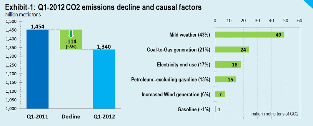
I teamed up with the folks at CO2 scorecard to analyze the causes of Q1 2012’s record low carbon emissions for the US, and you can read the full research note here.  The summary findings follow below:

In this research note we show that the mild winter of 2012 was the biggest factor in slashing first quarter’s CO2 emissions in the US to the lowest level in twenty years. Demand for natural gas and electricity for space heating in residential and commercial sectors took a major dip as the number of heating degree days plummeted in the first three months of 2012. As a result, the warm winter alone accounts for 43% of the total quarterly CO2 reductions.
Replacement of coal generation by natural gas cut another 21%. Three additional factors—decline in end-use electricity consumption, reduced consumption of petroleum products, and increased generation of wind power together contributed 35% to the total CO2 reductions. However, gasoline was essentially unchanged from the first quarter of 2011.
We discuss policy implications of these findings.
Link: http://www.co2scorecard.org/link/Index/257,12

Here’s the key graph, which tells the story nicely:

Short piece from Congressional Budget Office documenting causes for the increase in the deficit over the past 11 years

This two-pager gives the CBO’s latest estimates of what caused the increase in deficits in the past 11 years (for a bit of high-level discussion of the results, go here).  For those interested in causality (i.e., which actions are responsible for changes in the deficit and national debt) this is a great place to dig into the data.  Also see Ezra Klein’s recent article as well as my previous related posts from January 31, 2012 and August 24, 2011.

Bottom line: Before blaming a president for increases in the debt and deficit, you need to first understand what caused those increases and who is responsible for the decisions that led to that result.  Just saying “the debt was X trillion when the president took office and Y trillion today” is at best misleading.  The only accurate way to analyze the issue is to assess whose decisions contributed to the deficit and the associated increase in debt.

Make your data tell a story!

The Data Warehousing Institute newsletter dated August 21, 2012 contained an interview with me by Linda Briggs titled “Make your data tell a story”.

Here’s the first question and answer.  For the complete interview, go here.

Question: With more tools at our disposal for analyzing, charting, and displaying data, are visual presentations getting better?
Jonathan Koomey: That’s a tough question. Let me first narrow the scope to “visual display of quantitative information” (which also happens to be the title of Edward Tufte’s first and most famous book). I can’t really speak knowledgeably about presentations that include video or other fancy stuff, so I’ll focus on what I know.
Anecdotally, I have noticed few improvements in the general state of graphical display. I still see people using the default graphs in Excel, for example, even though those continue to be problematic. What Tufte calls “chart junk” is still more the rule than the exception, and abominations (such as bar charts with a superfluous third dimension that conveys no information) continue to be widely used.
My friend Stephen Few (author of Show Me the Numbers and Now You See It) recently gave me his view on progress in this area. There are some vendors, such as Tableau and Spotfire, that have studied graphical display and are helping users to do it more effectively, but many more still allow (and even encourage) the same appalling practices that have bedeviled this field for years. The difference is that companies pushing the state of the art understand what Steve calls “the science of data visualization.” The others don’t. The skills needed to build a big data warehouse aren’t the same as those needed for effective display of quantitative information, but too many vendors act as if they are, and don’t yet incorporate into their products what we now know about doing it right.
The key to improving the general practice of graphical display is for the vendors to retool their software to reflect the latest knowledge in this area. Once that happens, things should improve quickly, but I’ve been surprised by how long it has taken for the industry to take these ideas seriously. Tufte published his book Visual Display of Quantitative Information in 1981, and Show Me the Numbers came out in 2004. It’s long past time for the insights of Tufte and Few to make their way into all of the most widely used business intelligence tools.

Read more…

My TechNation interview about Cold Cash, Cool Climate with Moira Gunn on June 26, 2012, now posted

I had great fun talking about Cold Cash, Cool Climate:  Science-based Advice for Ecological Entrepreneurs with Moira Gunn of TechNation in June, and the interview is now posted here.

The interview focused on how we know climate is a problem, why uncertainty can make communicating the implications of the science difficult, why entrepreneurs are an important audience, and why it’s ridiculous to think that the problem of climate has been invented by a vast conspiracy of scientists.   It also lays out the rationale for not exceeding the 2 Celsius degree limit in what I think is a clear and compelling way.

I like how the interview turned out, but did mix at least one metaphor (I said “sell like wildfire”, combining “sell like hotcakes” and “spread like wildfire”).  It’s a good interview, though.  Please pass it on, and let me know what you think.

Another source of observational data on the effects of recent warming

The Arctic Sea-ice Monitor tracks the extent of sea ice over the Arctic, and has for a long time posted a wonderful graph that shows sea ice extent over each month in a given year.  In the new graph now appearing on their site (reposted below) they show the monthly averages for the 1980s, 1990s, and 2000s, and each decade shows significantly declining sea ice extent in the critical months of August, September, and October.  This graph is yet another fingerprint showing a warming world, based on actual measurements (not climate models).

And the big story right now is the 2012 line, which has been close to the lowest sea-ice extent ever recorded for the past few months.  We’ll know soon if 2012 will beat 2007 for minimum sea ice extent in September.

For those who really want to dig into the details, Real Climate has the story with lots of links and context.

Addendum, August 14, 2012:  Two commenters noted correctly that the volume of sea ice is also important, not just the extent.  The Polar Science Center gives those data, summarized in the graph just below.

Caption:  Total Arctic sea ice volume from PIOMAS showing the volume of the mean annual cycle, the current year, 2010 (the year of previous September volume minimum), and 2007 (the year of minimum sea ice extent in September). Shaded areas indicate one and two standard deviations from the mean.

This graph indicates that while 2007 and 2012 may be comparable in terms of sea ice extent, the later year has much lower sea ice volume, which is another indication of the warming trend we’ve seen over the past several decades.

For more details, check out the Arctic Sea Ice News and Analysis page.  And  see also this graph posted on Brave New Climate, which shows exponential decay for the minimum sea ice volume.  This is not a pretty picture!

Why climate change causes BIG increases in extreme weather

Jim Hansen just published a terrific summary of the past few decades of temperature measurements, and it shows the stark reality:  increasing the average temperature even a modest amount substantially increases the chances of extreme temperature events.

I showed this result conceptually in Figure 2-17 of Cold Cash, Cool Climate using a graph from the University of Arizona’s Southwest Climate Change Network:

Now, Hansen has calculated the actual distributions by decade to show what’s really been happening, and the results are striking.  The overall summary is in his Figure 2:

Figure 2. Temperature anomaly distribution: The frequency of occurrence (vertical axis) of local temperature anomalies (relative to 1951-1980 mean) in units of local standard deviation (horizontal axis). Area under each curve is unity. Image credit: NASA/GISS.  JK note added Aug. 14, 2012:  the horizontal axis is NOT in units of temperature but in terms of standard deviations from the mean.  For a normal distribution, which these graphs appear to be, about 68% of all the occurrences would be found within one standard deviation from the mean, and 95% of them would be within two standard deviations.  When I figure out how to convert these results to temperature I’ll post again.


Figure 3 breaks down the distributions by decade, and compares them to the 1951-1980 average:

Figure 3. Frequency of occurrence (vertical axis) of local June-July-August temperature anomalies (relative to 1951-1980 mean) for Northern Hemisphere land in units of local standard deviation (horizontal axis). Temperature anomalies in the period 1951-1980 match closely the normal distribution (“bell curve”, shown in green), which is used to define cold (blue), typical (white) and hot (red) seasons, each with probability 33.3%. The distribution of anomalies has shifted to the right as a consequence of the global warming of the past three decades such that cool summers now cover only half of one side of a six-sided die, white covers one side, red covers four sides, and an extremely hot (red-brown) anomaly covers half of one side. Image credit: NASA/GISS.


The interesting thing about these results is that the distribution not only shifts to the right, but it also flattens out and spreads over a broader area.  The extreme heat events increase very substantially compared to the 1951-1980 average, and this trend is only going to get worse unless we take serious action to reduce emissions.

The same basic conclusion holds for precipitation extremes also, though I haven’t seen those data plotted in this exact way.  Figure 2-7 in Cold Cash, Cool Climate shows how precipitation extremes for the US have increased in the past two decades:

These are actual measurements showing how the climate is changing.  So if you believe in reality, you need to heed what the measurements are telling us.  We need to reduce greenhouse gas emissions, and to do so in short order, otherwise we’re in for a whole lot more extreme weather like the summer of 2012, and I’m pretty sure that’s not something anyone wants to repeat.

Check out the Accidental Analyst!

Unless you’ve been asleep for years, it’s impossible to miss the data explosion.  In 1998, for example, the first Google page index counted 26 million unique web pages.  By 2008 that number had grown to 1 trillion, which means the number of web pages doubled every 8 months over that ten-year period.

Because of this torrent of data, statisticians are now “cool”, but in this data-rich world, even business folks who never trained to deal with numbers are being forced to face the inrush of data and try to turn it to their advantage by thinking in new ways. And that’s where The Accidental Analyst, a terrific new book by Eileen and Stephen McDaniel, comes in.

I like this book because it explains in plain English the tips and techniques you can use to become an Accidental Analyst.  These steps aren’t rocket science and don’t require math more complicated than addition, subtraction, multiplication and division.  If you can work a hand calculator and have basic common sense, you can use lessons from this book to achieve business success.  It’s as simple as that.

Of course, there’s a lot more to analysis than doing calculations, and the book walks you through all that, focusing specifically on tricks of the trade gleaned from the authors’ experience in doing analysis and training analysts.  By the end of the book you’ll know the questions to ask so that you’ll never again be at the mercy of vendors, colleagues, and competitors who traffic in “proof by vigorous assertion”.

The Accidental Analyst is a nice introduction to basic analytical techniques.  For more advanced readers, check out my book Turning Numbers into Knowledge.

Blog Archive
Stock1

Koomey researches, writes, and lectures about climate solutions, critical thinking skills, and the environmental effects of information technology.

Partial Client List

  • AMD
  • Dupont
  • eBay
  • Global Business Network
  • Hewlett Packard
  • IBM
  • Intel
  • Microsoft
  • Procter & Gamble
  • Rocky Mountain Institute
  • Samsung
  • Sony
  • Sun Microsystems
  • The Uptime Institute