The NYT article on Power, Pollution, and the Internet: My initial comments

Jim Glanz, writing in the New York Times this past Sunday, described existing inefficiencies in Internet infrastructure, but omitted important context that can help interested readers really understand the problem.  The article, in which I’m quoted, is Glanz, James. 2012. “Power, Pollution, and the Internet.” New York Times.  New York, NY.  September 23. p. A1.   A related “Room for Debate” section (in which I have an article) went online on Monday September 24, 2012.

The article conflates different types of data centers, and in the process creates a misleading impression for readers who are not familiar with this industry.   I like to divide the industry into four kinds of data centers:  public cloud computing providers (like Amazon, Google, Facebook, and Microsoft), scientific computing centers (like those at national laboratories and universities), co-location facilities (which house servers owned by other companies), and what I call “in-house” data centers (which are facilities owned and operated by companies whose primary business is not computing).  The fourth category is by far the dominant one in terms of floor area and total electricity use, and almost all the issues raised in the article apply most clearly to facilities in that category.

Each category of data centers has very different characteristics and constraints.   The scientific computing category is in a class by itself, because it runs computing jobs than can be queued up and these facilities thus do not need to respond to changes in demand.  The other three categories must respond in real time, which requires some slack in the system in case of unanticipated changes in demand.  That’s why quoting the 96.4% utilization of LBNL’s supercomputer in July 2012 (as the article does) says nothing about possibilities for increased utilization in the vast majority of data centers.

The public cloud providers are much more efficient than the “in-house” and collocation facilities.  One implication of the NYT article (as expressed, for example, by quotes from Hank Seader and Randall Victora) is that we’ll be using the computing resources one way or another, and it doesn’t matter where these are housed.  This conclusion is incorrect.  The low utilization numbers cited in the NYT article generally apply to the “in-house” and collocation facilities, not to the cloud providers (who have many more and different kinds of users, so utilization is generally much higher).  The infrastructure efficiencies in cloud computing facilities are higher as well.  For example, the Power Utilization (or Usage) Effectiveness in typical “in-house” data centers is between 1.8 and 1.9, while for cloud facilities it is closer to 1.1 (that means for every 1 kWh used in IT equipment, only 0.1 kWh is used for cooling, fans, pumps, power distribution, and other infrastructure).  So it really matters whether IT resources exist in cloud computing data centers or in standard “in-house facilities”, and the problems identified in the article mainly matter in the “in-house” facilities.

There are good reasons why cloud providers are more efficient, including economies of scale, diversity and aggregation of users, flexibility of operations, and ease of sidestepping organizational constraints.  There is also an underlying driver for greater efficiency that is critically important–the cloud providers have fixed the internal institutional problems that lead to separate budgets for the IT and facilities departments (split incentives) and dispersed responsibility for data center design, construction, and operations.  The vast majority of “in-house” and collocation facilities have not fixed these problems, so efficiency is not high (or not even) on the priority list.  And it’s institutional and not technical failures (the lack of proper cost allocation, management responsibility, and inventory tracking) that results in a large number of “comatose” servers, for example.

The problem is that the people who run the data centers for “in-house” and collocated facilities have little influence on these institutional issues.  It’s the people at the C-level in the corporation (CEO, CFO, CIO) who need to make these changes happen, and thus far there’s been little movement there in most companies.  That’s the biggest challenge, and it’s one I wish the article had highlighted.  Once these problems are fixed, big changes in efficiency follow rapidly and continue apace (they become part of the business culture and drive continuous improvements).

The article also ignores the value of the services being produced by data centers, which is the key reason why so many data centers have been built in the first place.  The value is so much higher than the costs that the inefficiencies in the “in-house” facilities are tolerated as long as reliability is maintained.

The article and the associated “Room for Debate” section seem to imply that it is consumers’ and companies’ demand for instantly available information that is at fault for the industry’s obsession with “uptime”, but the demand for information can be met in many ways, and the issue is how the industry chooses to satisfy the demand for information, and not the nature of the demand for information itself.  There are ways to deliver information with comparable levels of “uptime” but much lower costs and energy use (as the cloud computing providers have demonstrated), and we need to figure out ways for such innovations to be adopted in all “in-house” data centers.

Another (less important) issue I have with the article is that it uses the word “cloud” in its colloquial sense–i.e., anything on the other side of the users wall is “the cloud”.  In this context, however, it is more important to distinguish “cloud computing” from the other types of data centers I list above, because cloud data centers are designed and operated quite differently from those other types.  That’s the distinction that matters for understanding this issue, and the use of the colloquial term “cloud” just confuses people.

If you’ve already read the NYT article, I urge you to examine it again after reading this blog post.  Distinguishing between different types of facilities should yield crucial insight into why these inefficiencies exist and what we can do about them.  I’m interested to hear your thoughts.
New review of "Cold Cash, Cool Climate"

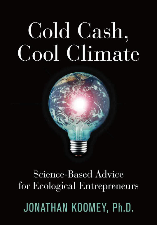
Writing in Environmental Research Web yesterday, Evan Mills of Lawrence Berkeley National Laboratory reviewed Cold Cash, Cool Climate:  Science-based Advice for Ecological Entrepreneurs.

Here are the first couple of paragraphs:

Entrepreneurs and investors alike will profit from Jonathan Koomey’s new book on how to cool the climate while garnering some cold cash. Starting with a well-reasoned case for urgent action to slash greenhouse-gas emissions, Koomey dispenses tips for innovators who can help turn the tide. While targeted at the business community, students, policymakers and even the general public will find this compelling book an easy read full of actionable suggestions. Koomey's blog summarizes the arguments.
Few of today’s climate and energy analysts have the skill or take the time to communicate their insights accurately to non-specialist audiences. Koomey – a seasoned energy and environmental researcher – effectively positions this book between the “hardcore technical” and “readable but imprecise popular”. He combines methods from multiple disciplines and boils an enormous literature down to its essential messages.

The review concludes:

The book ends on a highly optimistic reminder that the future is still ours to choose. The energy and economic pathways in front of us have never before been so divergent. Koomey’s book will help us choose wisely, and laugh all the way to the bank.

Read more…

A 2002 talk on climate change by the late Stephen H. Schneider, now posted online

The folks at PARC have posted online a 2002 talk on climate change by the late Stephen H. Schneider.  For those who didn’t know Steve, he was a genius unlike any other, and a very interesting speaker.  I heartily recommend that you check it out.

Is cheap natural gas really the cause of record low US carbon emissions?

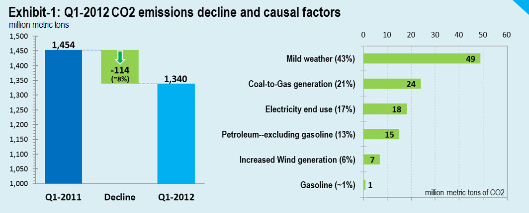
I teamed up with the folks at CO2 scorecard to analyze the causes of Q1 2012’s record low carbon emissions for the US, and you can read the full research note here.  The summary findings follow below:

In this research note we show that the mild winter of 2012 was the biggest factor in slashing first quarter’s CO2 emissions in the US to the lowest level in twenty years. Demand for natural gas and electricity for space heating in residential and commercial sectors took a major dip as the number of heating degree days plummeted in the first three months of 2012. As a result, the warm winter alone accounts for 43% of the total quarterly CO2 reductions.
Replacement of coal generation by natural gas cut another 21%. Three additional factors—decline in end-use electricity consumption, reduced consumption of petroleum products, and increased generation of wind power together contributed 35% to the total CO2 reductions. However, gasoline was essentially unchanged from the first quarter of 2011.
We discuss policy implications of these findings.
Link: http://www.co2scorecard.org/link/Index/257,12

Here’s the key graph, which tells the story nicely:

Short piece from Congressional Budget Office documenting causes for the increase in the deficit over the past 11 years

This two-pager gives the CBO’s latest estimates of what caused the increase in deficits in the past 11 years (for a bit of high-level discussion of the results, go here).  For those interested in causality (i.e., which actions are responsible for changes in the deficit and national debt) this is a great place to dig into the data.  Also see Ezra Klein’s recent article as well as my previous related posts from January 31, 2012 and August 24, 2011.

Bottom line: Before blaming a president for increases in the debt and deficit, you need to first understand what caused those increases and who is responsible for the decisions that led to that result.  Just saying “the debt was X trillion when the president took office and Y trillion today” is at best misleading.  The only accurate way to analyze the issue is to assess whose decisions contributed to the deficit and the associated increase in debt.

Make your data tell a story!

The Data Warehousing Institute newsletter dated August 21, 2012 contained an interview with me by Linda Briggs titled “Make your data tell a story”.

Here’s the first question and answer.  For the complete interview, go here.

Question: With more tools at our disposal for analyzing, charting, and displaying data, are visual presentations getting better?
Jonathan Koomey: That’s a tough question. Let me first narrow the scope to “visual display of quantitative information” (which also happens to be the title of Edward Tufte’s first and most famous book). I can’t really speak knowledgeably about presentations that include video or other fancy stuff, so I’ll focus on what I know.
Anecdotally, I have noticed few improvements in the general state of graphical display. I still see people using the default graphs in Excel, for example, even though those continue to be problematic. What Tufte calls “chart junk” is still more the rule than the exception, and abominations (such as bar charts with a superfluous third dimension that conveys no information) continue to be widely used.
My friend Stephen Few (author of Show Me the Numbers and Now You See It) recently gave me his view on progress in this area. There are some vendors, such as Tableau and Spotfire, that have studied graphical display and are helping users to do it more effectively, but many more still allow (and even encourage) the same appalling practices that have bedeviled this field for years. The difference is that companies pushing the state of the art understand what Steve calls “the science of data visualization.” The others don’t. The skills needed to build a big data warehouse aren’t the same as those needed for effective display of quantitative information, but too many vendors act as if they are, and don’t yet incorporate into their products what we now know about doing it right.
The key to improving the general practice of graphical display is for the vendors to retool their software to reflect the latest knowledge in this area. Once that happens, things should improve quickly, but I’ve been surprised by how long it has taken for the industry to take these ideas seriously. Tufte published his book Visual Display of Quantitative Information in 1981, and Show Me the Numbers came out in 2004. It’s long past time for the insights of Tufte and Few to make their way into all of the most widely used business intelligence tools.

Read more…

My TechNation interview about Cold Cash, Cool Climate with Moira Gunn on June 26, 2012, now posted

I had great fun talking about Cold Cash, Cool Climate:  Science-based Advice for Ecological Entrepreneurs with Moira Gunn of TechNation in June, and the interview is now posted here.

The interview focused on how we know climate is a problem, why uncertainty can make communicating the implications of the science difficult, why entrepreneurs are an important audience, and why it’s ridiculous to think that the problem of climate has been invented by a vast conspiracy of scientists.   It also lays out the rationale for not exceeding the 2 Celsius degree limit in what I think is a clear and compelling way.

I like how the interview turned out, but did mix at least one metaphor (I said “sell like wildfire”, combining “sell like hotcakes” and “spread like wildfire”).  It’s a good interview, though.  Please pass it on, and let me know what you think.

Another source of observational data on the effects of recent warming

The Arctic Sea-ice Monitor tracks the extent of sea ice over the Arctic, and has for a long time posted a wonderful graph that shows sea ice extent over each month in a given year.  In the new graph now appearing on their site (reposted below) they show the monthly averages for the 1980s, 1990s, and 2000s, and each decade shows significantly declining sea ice extent in the critical months of August, September, and October.  This graph is yet another fingerprint showing a warming world, based on actual measurements (not climate models).

And the big story right now is the 2012 line, which has been close to the lowest sea-ice extent ever recorded for the past few months.  We’ll know soon if 2012 will beat 2007 for minimum sea ice extent in September.

For those who really want to dig into the details, Real Climate has the story with lots of links and context.

Addendum, August 14, 2012:  Two commenters noted correctly that the volume of sea ice is also important, not just the extent.  The Polar Science Center gives those data, summarized in the graph just below.

Caption:  Total Arctic sea ice volume from PIOMAS showing the volume of the mean annual cycle, the current year, 2010 (the year of previous September volume minimum), and 2007 (the year of minimum sea ice extent in September). Shaded areas indicate one and two standard deviations from the mean.

This graph indicates that while 2007 and 2012 may be comparable in terms of sea ice extent, the later year has much lower sea ice volume, which is another indication of the warming trend we’ve seen over the past several decades.

For more details, check out the Arctic Sea Ice News and Analysis page.  And  see also this graph posted on Brave New Climate, which shows exponential decay for the minimum sea ice volume.  This is not a pretty picture!

Why climate change causes BIG increases in extreme weather

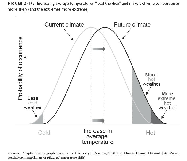
Jim Hansen just published a terrific summary of the past few decades of temperature measurements, and it shows the stark reality:  increasing the average temperature even a modest amount substantially increases the chances of extreme temperature events.

I showed this result conceptually in Figure 2-17 of Cold Cash, Cool Climate using a graph from the University of Arizona’s Southwest Climate Change Network:

Now, Hansen has calculated the actual distributions by decade to show what’s really been happening, and the results are striking.  The overall summary is in his Figure 2:

Figure 2. Temperature anomaly distribution: The frequency of occurrence (vertical axis) of local temperature anomalies (relative to 1951-1980 mean) in units of local standard deviation (horizontal axis). Area under each curve is unity. Image credit: NASA/GISS.  JK note added Aug. 14, 2012:  the horizontal axis is NOT in units of temperature but in terms of standard deviations from the mean.  For a normal distribution, which these graphs appear to be, about 68% of all the occurrences would be found within one standard deviation from the mean, and 95% of them would be within two standard deviations.  When I figure out how to convert these results to temperature I’ll post again.


Figure 3 breaks down the distributions by decade, and compares them to the 1951-1980 average:

Figure 3. Frequency of occurrence (vertical axis) of local June-July-August temperature anomalies (relative to 1951-1980 mean) for Northern Hemisphere land in units of local standard deviation (horizontal axis). Temperature anomalies in the period 1951-1980 match closely the normal distribution (“bell curve”, shown in green), which is used to define cold (blue), typical (white) and hot (red) seasons, each with probability 33.3%. The distribution of anomalies has shifted to the right as a consequence of the global warming of the past three decades such that cool summers now cover only half of one side of a six-sided die, white covers one side, red covers four sides, and an extremely hot (red-brown) anomaly covers half of one side. Image credit: NASA/GISS.


The interesting thing about these results is that the distribution not only shifts to the right, but it also flattens out and spreads over a broader area.  The extreme heat events increase very substantially compared to the 1951-1980 average, and this trend is only going to get worse unless we take serious action to reduce emissions.

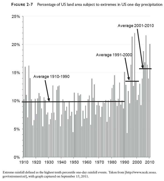
The same basic conclusion holds for precipitation extremes also, though I haven’t seen those data plotted in this exact way.  Figure 2-7 in Cold Cash, Cool Climate shows how precipitation extremes for the US have increased in the past two decades:

These are actual measurements showing how the climate is changing.  So if you believe in reality, you need to heed what the measurements are telling us.  We need to reduce greenhouse gas emissions, and to do so in short order, otherwise we’re in for a whole lot more extreme weather like the summer of 2012, and I’m pretty sure that’s not something anyone wants to repeat.

Check out the Accidental Analyst!

Unless you’ve been asleep for years, it’s impossible to miss the data explosion.  In 1998, for example, the first Google page index counted 26 million unique web pages.  By 2008 that number had grown to 1 trillion, which means the number of web pages doubled every 8 months over that ten-year period.

Because of this torrent of data, statisticians are now “cool”, but in this data-rich world, even business folks who never trained to deal with numbers are being forced to face the inrush of data and try to turn it to their advantage by thinking in new ways. And that’s where The Accidental Analyst, a terrific new book by Eileen and Stephen McDaniel, comes in.

I like this book because it explains in plain English the tips and techniques you can use to become an Accidental Analyst.  These steps aren’t rocket science and don’t require math more complicated than addition, subtraction, multiplication and division.  If you can work a hand calculator and have basic common sense, you can use lessons from this book to achieve business success.  It’s as simple as that.

Of course, there’s a lot more to analysis than doing calculations, and the book walks you through all that, focusing specifically on tricks of the trade gleaned from the authors’ experience in doing analysis and training analysts.  By the end of the book you’ll know the questions to ask so that you’ll never again be at the mercy of vendors, colleagues, and competitors who traffic in “proof by vigorous assertion”.

The Accidental Analyst is a nice introduction to basic analytical techniques.  For more advanced readers, check out my book Turning Numbers into Knowledge.

Marty Hoffert hits the climate nail on the head

The frustration of scientists about how the climate problem is being ignored came out in full relief when Marty Hoffert, an NYU physicist, sent this missive to Andy Revkin in response to a post at dot earth:

However welcome the news may be to market economists — and I’m confident Exxon-Mobil and company are licking their chops over continuing our highly profitable to them fossil fuel energy infrastructure — it’s an unmitigated environmental disaster for climate change: “Game Over,” as Jim Hansen rightly says.
Shale gas, shale oil and tar sands don’t fundamentally change estimates of total fossil fuel resources; but these “unconventional” sources, now more cost-effective to extract as fuel for the bottomless pit of world energy demand, will make disastrous climate shifts from the CO2 greenhouse a near-certainly. Forget solar, wind and nuclear fission. They can’t compete costwise now with coal-fired electricity, and unconventional cheap hydrocarbons could become as cheap as coal on a dollars per Joule of energy basis.
The result will be a hothouse planetary climate as different from today’s as the middle Cretaceous a hundred million years ago was, when sea level was a hundred meters higher and both poles were de-glaciated; when dinosaurs roamed a verdant Antarctic continent. This will happen virtually instantaneously from a geological perspective as fossil fuel resources accumulated over hundreds of millions of years are burned in a hundred years or so and CO2 in the atmosphere rises as much as fourfold over pre-industrial values.
The best analogy I can think of is watching the rise of Hitler from an isolationist USA in the late thirties as the threshold for stopping him early enough to matter is passed and a holocaust of some as yet unknown horror becomes inevitable. Optimists might observe that Homo sapiens survived WWII and the subsequent cold war. But the coming inundation of coastal zones and cities along with massive species extinctions will likely be far worse. We will need to burn even more fossil fuel to “adapt” to this change by building seawalls and air conditioning, an option perhaps for rich countries, or mass migration inland and poleward for everyone else. Moreover, any attempts by our descendants to rebuild high tech civilization will be seriously hampered by the depleted state of both conventional and unconventional hydrocarbon fuels. Maybe they, unlike ourselves, will learn to go straight to solar and controlled fusion power, necessity being the mother of invention. More likely is a feudal agricultural economy in high latitude lands still fertile for crops and habitable in climate; or in the worst case scenario, hunter-gathering capable of supporting perhaps a million or so humans worldwide.
Many climate researchers breathed a sight of relief when Jim Lovelock backed off from nightmare scenarios with humans huddled in polar refugia against a greenhouse-induced waterworld. Too many accept the GOP denialist scam claiming human-induced global warming is a hoax to risk being perceived as alarmists, or worse. We didn’t sign on for this. We went into science and engineering, many of us, not only for the thrill of learning new by mastering objective nature, but to avoid the crazy subjectivity of human behavior. Give us labs and computers and some money and let us be geeks. We make mistakes, but we didn’t sign on for abuse. Thank you Ben Santer, Michael Mann, Jim Hansen, Ken Caldeira and all my other climate/energy colleagues for your courage to speak truth to crazy. The truth is that if we burn identified fossil fuel resources, particularly the so-called unconventional ones now making free marketeers dance with joy, it is only a matter of time before a transition to “hothouse Earth” occurs.
A technology optimist, I like to believe that some genetic evolution of the human genome can produce intelligent Homo superior better adapted to living in a high tech world wrought by scientific revolutions. I hope the spark of self-awareness survives, even if our particular experiment by nature doesn’t adapt and survive.
If, as Carl Sagan speculated, technological civilizations are time bombs triggered by the inability of species evolved in technology-free environments to adapt to the technologies they themselves create, then we may be destined for self-destruction. Short lifetimes of technological civilizations is a reason for the absence of intelligent life in our Milky Way galaxy according to the Drake Equation for computing the number of contemporaneous technological civilizations in a galaxy. Too bad, if true, as we have now discovered that extrasolar planets sound other stars are a dime a dozen, and may discover potentially habitable “other Earths” soon with NASA’s Kepler Planet Finder.

This warning is about as clear as can be, and it echoes what I wrote in my post  showing why fossil fuel abundance is an illusion.  It’s time to wake up and acknowledge reality, folks.  We can’t burn it all, and if we keep pretending we can, we’ll just build more infrastructure that will have to be scrapped sooner rather than later, as I pointed out in Cold Cash, Cool Climate.

Two new interviews about entrepreneurs and the climate problem

Kate Gammon at Fast Company and Brenna Donoghue at Ethical Ocean just published interviews with me about entrepreneurs and the climate problem.  The Fast Company article is here, and the Ethical Ocean article is here.

In these interviews I talk about why I chose to focus on entrepreneurs, why ecological entrepreneurship is less common than it needs to be, and why I’m still hopeful we can avert the worst consequences of climate change, in spite of the difficulties before us.

Let me know what you think!

Indirect greenhouse gas emissions from electricity generation technologies

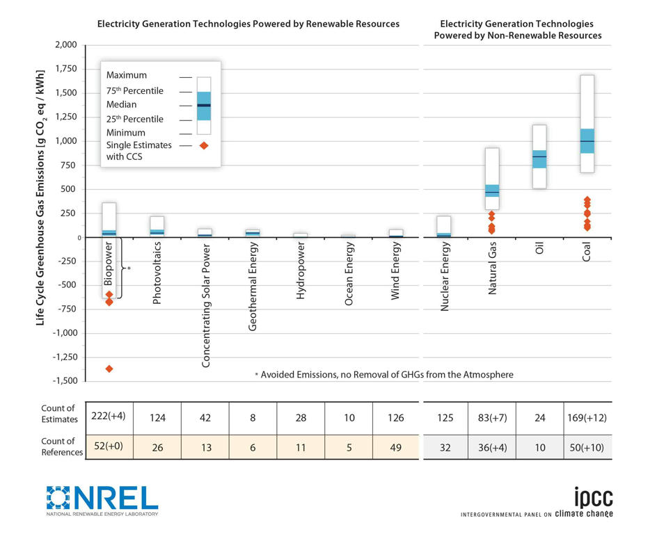
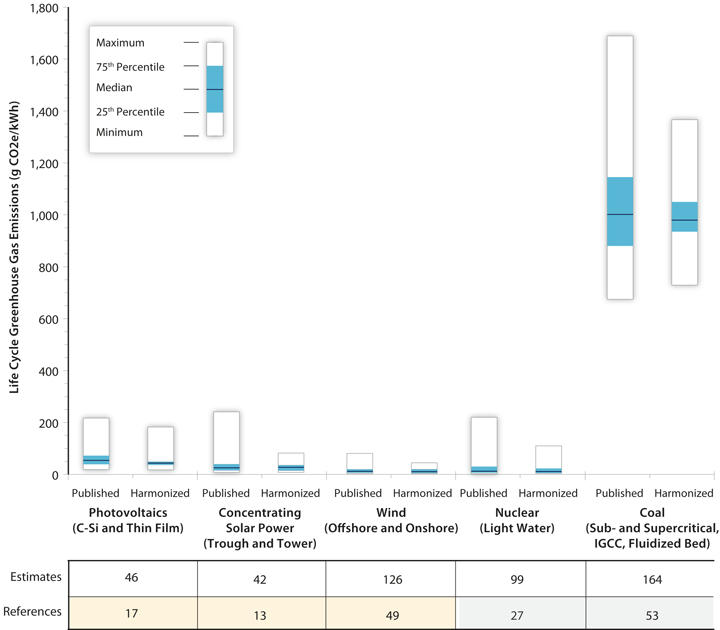
Garvin Heath and his colleagues at the National Renewable Energy Laboratory last month published analyses of the indirect greenhouse gas emissions from electricity generation technologies.  This work was also summarized in a set of articles that appeared in a special issue of the Journal of Industrial Ecology (which also includes some additional articles analyzing other energy technologies).  The results are the product of what’s called “life cycle analysis”, where emissions from all parts of the lifecycle of an energy technology, including exploration, production, transportation, use, and decommissioning are carefully tallied.  Such analysis allows consistent comparisons of emissions from the whole system, not just one phase in the life cycle.

The key findings are summarized in two figures, which I reproduce below. The first, which was published in the IPCC Special Report on Renewables, is more comprehensive, and it includes estimates as published, without any adjustments.  The second figure summarizes results that have been harmonized to make the comparison as consistent as possible.

Figure 1:  Comparison of as-published lifecycle greenhouse gas emission estimates for electricity generation technologies. The impacts of the land use change are excluded from this analysis

Figure 2:  Comparison of as-published and harmonized lifecycle greenhouse gas emission estimates for selected electricity generation technologies

What I conclude from both figures is that all non-fossil generation technologies have modest indirect emissions on average compared to fossil fuels, with most of the non-combustion renewables (like wind, concentrating solar, ocean, and hydro) having the lowest uncertainty about their emissions.   The big range for biomass comes from different assumptions about whether the fuel source is harvested sustainably or not, while the range for nuclear power depends on the fuel enrichment process used (some are more electricity intensive than others) and on the source of the electricity for that process.  I think the range for photovoltaics is because of the many different technologies used to generate electricity from sunlight, but I’m not certain, so I’ll ask Garvin to enlighten us and report back.

The other important point about these indirect emissions is (as Saul Griffith points out) that even though they are small for most non-fossil resources, we are under tight time constraints (and a tight carbon budget) for keeping the earth from warming more than 2 Celsius degrees from preindustrial times. Whatever infrastructure we build to meet that challenge will eat up some of the carbon budget, even if we use the source with the lowest indirect emissions, so we really only get one shot at creating a stable climate.  That is an example of path dependence in its purest form, and keeping in mind the importance of life-cycle emissions can help us think more clearly about how to create a more hopeful (and cooler) future.

The journal has made the articles freely downloadable, as a public service.

The Journal of Industrial Ecology is an international peer-reviewed bimonthly journal owned by Yale University and published by Wiley-Blackwell.  It is the official journal of the International Society for Industrial Ecology.

Addendum, June 26, 2012:  Garvin replied to my email with this explanation about the ranges for solar photovoltaics and biomass:

As for the range from PV, it is due to both technology and manufacturing process variation but also solar resource (some estimates considered low solar resource sites) and to some extent the GHG intensity of the source energy mix.
As for biomass, one key variation is whether the feedstock is residue/waste (implying no burdens from feedstock production) or a crop one grows intentionally (which carries the burdens of the production). But the bioenergy system is very complex, so there are a host of other differences – climate, feedstock selection, irrigation requirements, transportation requirements, fertilizer usage, tillage regime, processing requirements (especially drying), etc. NREL has developed a version of our popular System Advisor Model for biopower which allows the user to specify their “system” and returns an estimate of the life cycle GHG emissions: https://sam.nrel.gov/ to download and find documentation.

Another subsidy for coal: Washington Post today on flawed coal auctions in the Powder River basin

The Powder River Basin, one of the biggest sources of coal in the Western US, has a system for leasing mining rights that is deeply flawed, and has cost taxpayers “as much as $28.9 billion over the past 30 years”.  From the article in the Washington Post today:

Powder River Basin coal leasing prompts IG, GAO reviews

By , Sunday, June 24, 5:25 PM

The government’s longtime practice of auctioning coal mining rights to a single bidder may have cost taxpayers as much as $28.9 billion over the past 30 years, according to an analysis to be released Monday by the Institute for Energy Economics and Financial Analysis, a Cambridge, Mass.-based think tank.

The non-competitive nature of the federal leasing program is being reviewed by the Interior Department’s inspector general and also will be the subject of an audit by the Government Accountability Office, according to officials at the Bureau of Land Management, which oversees the leasing program.

As I’ve discussed before, there’s nothing more consistent with economic efficiency (not to mention individual responsibility) than charging people the true costs of their actions, and subsidies like the ones described in this article distort economic choices in a significant way. Time for them to end!

For those interested in the unpaid externalities of coal and other fossil fuels, I refer you to two refereed journal articles from last year:

Muller, Nicholas Z., Robert Mendelsohn, and William Nordhaus. 2011. “Environmental Accounting for Pollution in the United States Economy.” American Economic Review vol. 101, no. 5. August. pp. 1649–1675.

Epstein, Paul R., Jonathan J. Buonocore, Kevin Eckerle, Michael Hendryx, Benjamin M. Stout Iii, Richard Heinberg, Richard W. Clapp, Beverly May, Nancy L. Reinhart, Melissa M. Ahern, Samir K. Doshi, and Leslie Glustrom. 2011. “Full cost accounting for the life cycle of coal.” Annals of the New York Academy of Sciences. vol. 1219, no. 1. February 17. pp. 73-98.

Addendum, June 25, 2012:  Don’t forget the campaign to #EndFossilFuelSubsidies.

GigaOm today released their list of "10 innovators changing the game for Internet infrastructure"

GigaOm named me one of “10 innovators changing the game for Internet infrastructure”.  The article introducing the list describes the shifts now ongoing in the industry towards infrastructure, platform, and software as a service.  In the past I’ve characterized this trend as “separating physical from virtual servers”.  It is beneficial from a software management perspective but it also allows for resource savings in the underlying hardware, because it allows you to redefine reliability.

For example, in most “in-house” data centers, reliability is defined as keeping a particular piece of software running on a particular server 100% of the time.  But if you design the software properly so it doesn’t depend on any one physical server (as Google does, for example) then the software will route around a server that dies.  That means you no longer need to have two power supplies on each server, which saves electricity and capital costs, and if a server dies you just recycle it, no fuss, no muss.  That’s a pretty good deal!

Blog Archive
Jonathan Koomey

Koomey researches, writes, and lectures about climate solutions, critical thinking skills, and the environmental effects of information technology.

Partial Client List

  • AMD
  • Dupont
  • eBay
  • Global Business Network
  • Hewlett Packard
  • IBM
  • Intel
  • Microsoft
  • Procter & Gamble
  • Rocky Mountain Institute
  • Samsung
  • Sony
  • Sun Microsystems
  • The Uptime Institute