“How could there be that much value available that was only uncovered after the initiative to cut greenhouse gases, in effect to use energy more effectively, and reduce emissions of gases such as methane and halons? Simply put, almost everyone was busy with other things, and not looking for these savings. And perhaps more to the point, people had accepted a certain way of doing things that was not optimal, but was the way they had been done for a very long time. When you reset the context for the operation, which is what the greenhouse gas target setting did, smart operators find a more attractive solution.”
I wrote about this general lesson in Cold Cash, Cool Climate: Science-based Advice for Ecological Entrepreneurs back in 2012, talking about the power of the general approach of “working forward toward a goal”. In BP’s case, the goal was modest GHG emissions reductions of 10%, and setting that goal helped the institution realize possibilities it hadn’t seen before. This approach “frees you from the constraints embodied in your underlying assumptions and worldview” and prompts you to assess ideas that wouldn’t normally come up in the course of normal operations.
Another insight is that the opportunities that arise from this approach are a renewable resource:
When I asked my friend Tim Desmond at Dupont whether his Six Sigma team (which is responsible for ferreting out new cost-saving opportunities across some of Dupont’s divisions) would ever run out of opportunities, he said “No way!” Changes in technology, prices, and institutional arrangements create opportunities for cost, energy, and emissions savings that just keep on coming.
Just because companies operate in a certain way doesn’t make it “optimal” for the current situation. There are always ways to improve operations, cut costs, and reduce emissions. We just need to look.
Finally, it’s important to set such goals in the context of whole systems integrated design, in which we start from scratch to re-evaluate tried and true ways of performing tasks. Rocky Mountain Institute has for years championed the power of “Factor Ten Engineering”, which allows us to create new ways of accomplishing the same tasks with substantial improvements in efficiency and emissions.
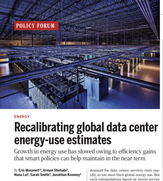
• Total global data center electricity use increased by only 6% from 2010 to 2018, even as the number of data center compute instances (i.e. virtual machines running on physical hardware) rose to 6.5 times its 2010 level by 2018 (compute instances are a measure of computing output as defined by Cisco).
• Data center electricity use rose from 194 TWh in 2010 to 205 TWh in 2018, representing about 1% of the world’s electricity use in 2018.
• Computing service demand rose rapidly from 2010 to 2018. Installed storage capacity rose 26 fold, data center IP traffic rose 11 fold, workloads and compute instances rose six fold, and the installed base of physical servers rose 30%.
• Computing efficiency rapidly increased, mostly offsetting growth in computing service demand: PUE dropped by 25% from 2010 to 2018, server energy intensity dropped by a factor of 4, the average number of servers per workload dropped by a factor of 5, and average storage drive energy use per TB dropped by almost a factor of 10.
• Expressed as energy use per compute instance, the energy intensity of the global data center industry dropped by around 20% per year between 2010 and 2018. This efficiency improvement rate is much greater than rates observed in other key sectors of the global economy over the same period.
• We also showed that current efficiency potentials are enough to keep electricity demand roughly constant for the next doubling of computing service demand after 2018, if policy makers and industry keep pushing efficiency in their facilities, hardware, and software.
• We offered three primary areas for policy action: (1) extend current efficiency trends by stressing efficiency standards, best practice dissemination, and financial incentives; (2) increase RD&D investments in next generation computing, storage, and heat removal technologies to deliver efficiency gains when current trends approach their limits, while incentivizing renewable power in parallel; and (3) invest in robust data collection, modeling, and monitoring.
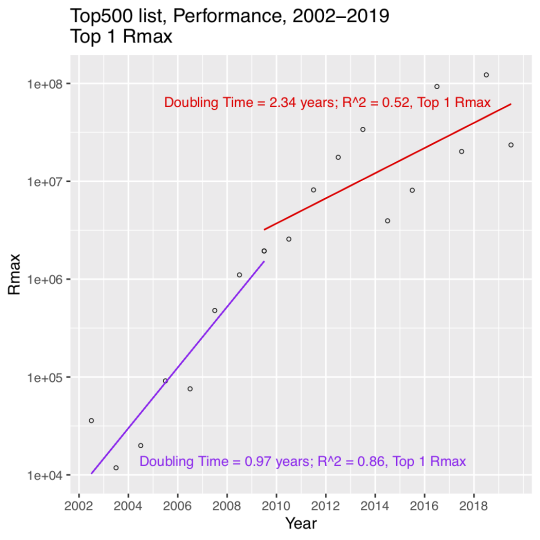
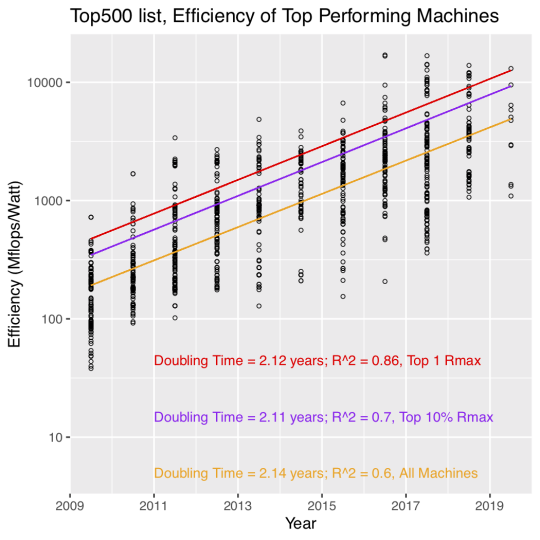
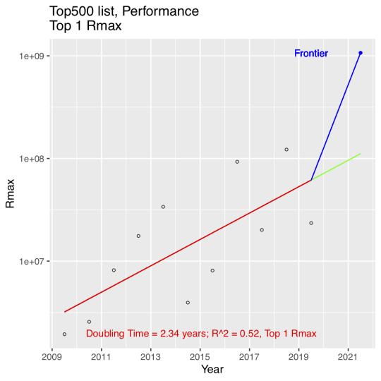
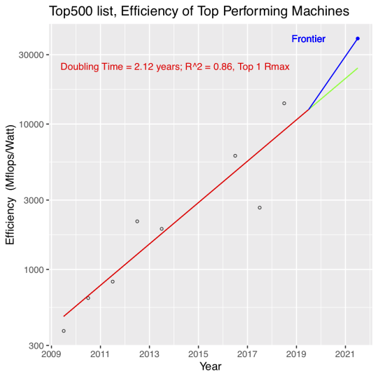
The energy efficiency of computing devices is a topic of ongoing research and public interest. While trends in the efficiency of laptops and desktops have been well studied, there has been surprisingly little attention paid to trends in the efficiency of high-performance computing installations (known colloquially as “supercomputers”). This article analyzes data from the industry site Top 500 (http://www.top500.org) to assess how the efficiency of supercomputers has changed over the past decade. It also compares how the efficiency and performance of a recently announced supercomputer, scheduled to be completed in 2021, compares to a simple extrapolation of those historical trends. The maximum performance of the most powerful supercomputers doubled every 2.3 years in the past decade (representing a slowdown from doubling every year from 2002 to 2009), while the efficiency of those computers doubled every 2.1 years from 2009 to 2019.
The Top 500 data have some issues, but this effort is a reasonable attempt to glean some meaning from them. We focused on analyzing each supercomputer based on the year that it started operation, so we could track meaningful technology trends. The Top 500 tracks the same supercomputers over time as they move down the list of top 500 machines, so we eliminated all but the first instance of any particular installation’s listing in the Top 500.
We split analysis of the performance of supercomputers into two periods, 2002 to 2009 and 2009 to 2019. The 1st period shows rapid growth (doubling every year or so) while the 2nd period shows a much slower doubling time of about 2.3 years, as well as much great variance in the data.
The efficiency data only start to become reliable around 2009, so that’s where we started the data analysis. Efficiency of supercomputers in the Top 500 data doubled every 2.1 years for the top performing machine, the top 10% of the top performing machines, and for the complete set of machines reported in the Top 500, which is pretty remarkable regularity. One caveat is that the R-squared of the linear regression goes down a lot as we regress on the bigger data sets.
We then focused in on the trend for the top performing machine so we could extrapolate that trend and compare it to an upcoming supercomputer (Frontier) built using Cray and AMD technology. The performance trend data show that Frontier is significantly above the trend line when it’s expected to start operation in 2021.
The story is the same for efficiency, although Frontier’s height above the trend line is less dramatic than for performance.
The details of how Frontier is expected to achieve these results are not yet public, but the article discusses some of the most promising areas for efficiency improvements as well as focuses on the need for future work, especially in the area of co-design of hardware and software.
In October 2019, many news outlets (including Phys.org) reported that watching half an hour of Netflix would emit the same amount of carbon dioxide (1.6 kg) as driving four miles. This appears to be yet another amazing “factoid” about information technology’s environmental footprint that has little relationship to reality.
I dug into the calculations, at the prompting of the BBC, and figured out the real story. Half an hour of Netflix emits less than 20 grams of carbon dioxide, probably much less. The BBC interviewed me last week and did a nice story about it.
The Museum of American Heritage is a fantastic independent museum in Palo Alto, California. We needed a short activity to pass the time (we were in Palo Alto for coding lessons for one of our boys) and I discovered this place online. What a find it is!
The museum is a collection of artifacts from the 1800s and early 1900s, mostly gadgets of various sorts. It has a “general store” that uses the artifacts from one of the founders (whose parents owned a general store in the area until 1965). Some familiar brands are there if you look closely.
Our boys had a go at dialing my phone number on an old rotary phone (they needed a hint).
They had a real ice box! The big block of ice went in the upper left hand compartment and a bucket to catch melting water was in the lower right. Food went into the right hand compartment. Note the thickness of the doors. Well insulated!
They also had an early 1900s fridge. Apparently it used freon and needed that big condenser on top. The compartment wasn’t very big, maybe 1.5 feet x 3 feet by 1 feet deep, if that. Also note the tiny freezer.
For the kid set, the best features were the erector sets (not featured, but a source of endless fun) and the working old-style pinball machine.
We also saw a cool bacon cooker! The fat drips off the rounded metal into the platter below. This looks like a gadget someone should make a modern version of now.
Finally, we showed up on the same day as the Palo Alto “Repair Cafe” in which experts with tools help people who bring in their old appliances to get fixed up. It was quite a scene. It happens quarterly.
This little museum vastly exceeded our expectations. If you are in the area, by all means give it a go.
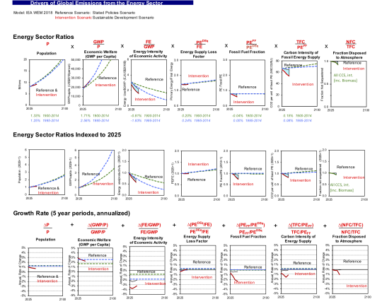
A couple of weeks ago, the International Energy Agency (IEA) released emissions scenarios related to the World Energy Outlook (WEO). We’ve used our spreadsheets to disentangle the drivers for those 2019 scenarios. We express the results in what we call a “dashboard of key drivers” (see below).
The 2019 scenarios are based on IEA’s WEO model, which comes out every year. A related set of scenarios comes from IEA’s Energy Technology Perspectives model. You can read about both sets of analyses here.
For more background, see the post on IEA historical drivers of energy sector carbon dioxide emissions here. For our analysis of key drivers for the 2017 ETP scenario called “Beyond 2 Degrees”, go here.
The reference for our 2019 article [1] upon which the decomposition analysis is based is at the end of this post. Email me for a PDF copy if you can’t get access otherwise. We also have an excel workbook all set up to do these decompositions and graphs, so let me know if you’d like a copy.
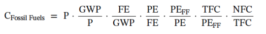
Let’s first look at an equation known as the Kaya Identity, which describes fossil carbon emissions as the product of four terms: Population, GDP/person (wealth), Primary Energy/GDP, and Carbon dioxide emissions/primary energy.
Over time, analysts have realized that this four-factor identity collapses some important information. That’s why, in our 2019 article, we moved to the expanded Kaya identity, with several more terms:
The components of this identity are as follows:
CFossil Fuels represents carbon dioxide (CO2) emissions from fossil fuels combusted in the energy sector,
P is population,
GWP is real gross world product (measured consistently using Purchasing Power Parity here and adjusted for inflation),
FE is final energy,
PE is total primary energy, calculated using the direct equivalent (DEq) method (electricity from non-combustion resources is measured in primary energy terms as the heat value of the electricity to first approximation),
PEFF is primary energy associated with fossil fuels,
TFC is total fossil CO2 emitted by the primary energy resource mix,
NFC is net fossil CO2 emitted to the atmosphere after accounting for fossil sequestration.
For historical data, there is no sequestration of carbon dioxide emissions, so the last term is dropped in the historical blog post, but included for future scenarios.
Note that this identity applies only to carbon dioxide emissions from the energy sector. We use an additional additive dashboard for future scenarios to describe industrial process emissions, land use changes, and effects of other greenhouse gases, but IEA doesn’t report all those data, so I’m focusing just on the energy sector here.
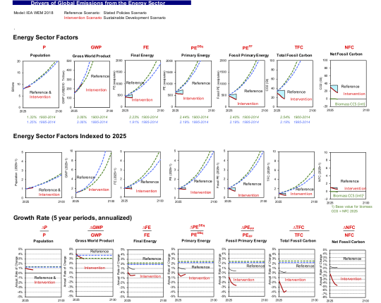
Discussion of Figure 1 (Factors)
The first graph is what we call our graph of key factors, from the indented list above. In the first row we show each term in its raw form for both the reference case (in black) and the intervention case (in red). The second row shows indices with 2025 = 1.0. And the last term shows the annual rate of change in each term for reference and intervention cases. In each case, we plot historical trends from IIASA’s PFU database for each factor from 1900 to 2014 (in green dashed lines) and 1995 to 2014 (in blue dashed lines)
The total fossil carbon is the end result of the other factors, which drive emissions. It grows modestly from 2025 to 2040 (when the new IEA scenarios end). This was unexpected for me (similarly to the 2017 ETS scenario), and it suggests an area of fruitful inquiry (and comparison to other reference cases). I would have expected higher growth in emissions in a reference case, but it does indicate some minor (but insufficient) progress in reducing projected emissions growth.
Population doesn’t vary at all between reference and intervention scenarios, which is commonplace for such projections. Population is not seen as a lever for climate policy except in rare cases, mainly for ethical reasons. There may be policies (like educating and empowering women) that we should do for other reasons, but almost never are these considered as climate policies (and that’s appropriate, in my view).
Another observation about population emerges from these data also. Projected population growth to 2040 is slower than historical trends. This result mainly comes from long term changes that almost all demographers agree are underway, and this picture of slowing population growth is almost universal in long run energy scenarios. Unlike the 1971 to 2016 period, when population was responsible for half of growth in energy sector GHGs, this driver will be far less important to emissions in the future.
Gross World Product (GWP) is another key driver, and that term is projected to increase by more almost three quarters by 2040 in both the reference and intervention cases.
Final energy (e.g., energy consumption measured at the building meter or the customer’s gas tank) is projected to grow modestly in the reference case and decline modestly in the intervention case. Same for primary energy. Both grow much more slowly than historical trends, which is another interesting area of investigation.
Fossil primary energy is roughly constant in the reference case and declines substantially in the intervention case. Same for total fossil carbon and net fossil carbon. Note the green line in the last column for the top two rows, where we plot the contribution of biomass CCS to net emissions reductions in the intervention case for comparison. Though these net emissions savings are often counted outside of the energy sector, they are linked to the energy sector and it’s useful to show their magnitude here for comparison.
The last row of the dashboard shows annual rates of change, which reveal some interesting trends and suggests further investigations. Population grows at a modest but declining rate after 2030. Real GWP growth slows to 2040 but still remains above 3%/year by 2040.
Final energy in the reference case shows modest but declining annual growth rates, while the Intervention case slightly declines over the analysis period.
Primary energy growth rates decline for the reference case and increase for the intervention case (but only after 2030). This means that there are more conversion losses in the energy system over time after 2030 in the intervention case (because final energy growth rates are mostly negative during the forecast period for the intervention case). The effects of these different trends are modest, however.
Fossil primary energy growth is modest over the reference case, but is negative (from -1% to almost -3%/year) for the analysis period. Total fossil carbon and Net Fossil Carbon show modest growth in the reference case and strong annual declines in the intervention case.
Discussion of Figure 2 (Ratios)
The 2nd graph below shows the expanded Kaya identity ratios. Population is the same, but all the other columns show ratios from the 2nd equation above. Population and wealth per person (the first two terms in the Kaya identity) are the biggest drivers of emissions in the reference case, while the energy intensity of economic activity declines to offset some of the growth in the first two terms.
The ratio of final energy to GWP tracks trends since 1995 for the reference case, and declines more rapidly in the intervention case. Why the rate of decline should become more strongly negative to 2030 and then rise again (leading to V-shaped curves for rates of change) is a question worth asking the modelers.
As expected from the discussion above, the energy supply loss factor suggests losses are roughly constant in the reference case and grow by a tiny amount in the intervention case. The fossil fuel fraction (which shows switching from fossil fuels to alternatives) declines substantially over the analysis period, as does the carbon intensity of fossil energy supply (which shows switching among fossil fuels). Interestingly, there’s a step change in the rates of change for the carbon intensity of energy supply in the last five years of the forecast, and it would be interesting to know from the modelers why this comes about.
The last column shows the extent of carbon sequestration as well as carbon sequestration from biomass, which have a modest effect in the Intervention scenario. This column is measured as a fraction of total fossil carbon emitted, so some of the drop in this ratio is associated with declining absolute amounts of fossil carbon over time. Nevertheless, this graph indicates measurable but modest use of carbon sequestration (both conventional and biomass related) in this scenario.
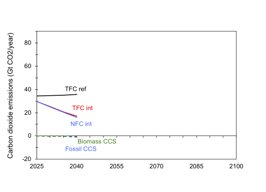
Figure 3: Carbon sequestration in the reference and SDS scenarios
The effect of CCS in the SDS scenario is modest. The difference between TFC reference and TFC Intervention is the result of all factors other than sequestration, and then the tiny difference between TFC Intervention and NFC Intervention is the effect of CCS. We also put absolute reductions from Biomass and Fossil CCS below the zero line. The Biomass CCS effect is close to zero and Fossil CCS effect is small.
Note that IEA does not release CCS results for the Intervention case for 2025 and 2035, only for 2030 and 2040. My colleague Zachary Schmidt fit an exponential curve to the 2030 and 2040 results and used the fitted curve to estimate CCS effects in 2025 and 2035 in the Intervention case.
This example illustrates the use of our decomposition dashboards for the 2019 2019 WEO results. It’s clear from this review that IEA needs to extend its WEO scenario past 2040, which I assume is in the works. It would also be interesting to compare trends in the final energy intensity of economic activity and the fossil fuel fraction to other studies to see whether the IEA projections could become more aggressive.
References
1. Koomey, Jonathan, Zachary Schmidt, Holmes Hummel, and John Weyant. 2019. “Inside the Black Box: Understanding Key Drivers of Global Emission Scenarios.” Environmental Modeling and Software. vol. 111, no. 1. January. pp. 268-281. [https://www.sciencedirect.com/science/article/pii/S1364815218300793]
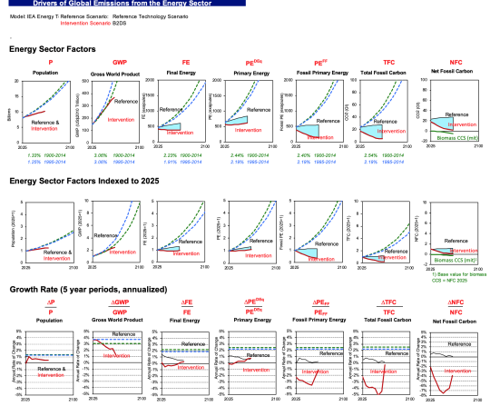
There’s been discussion recently about the upcoming release of the 2019 International Energy Agency (IEA) scenarios related to the World Energy Outlook (WEO). We’ve worked in the past few months to disentangle the drivers for a key 2017 scenario, what IEA calls their “Beyond 2 degrees” (B2DS) scenario and I wanted to post these results so we’ll have something to which to compare when the 2019 scenarios are released. We express the results in what we call a “dashboard of key drivers” (see below).
The 2017 scenario is based on IEA’s Energy Technology Perspectives (ETP) model, which is different from the World Energy Outlook model. While the WEO comes out every year the ETP analyses come out at irregular intervals. You can read about both sets of analyses here.
For more background, see the post on IEA historical drivers of energy sector carbon dioxide emissions here. The reference for our 2019 article [1] upon which the decomposition analysis is based is at the end of this post. Email me for a PDF copy if you can’t get access otherwise. We also have an excel workbook all set up to do these decompositions and graphs, so let me know if you’d like a copy.
Let’s first look at an equation known as the Kaya Identity, which describes fossil carbon emissions as the product of four terms: Population, GDP/person (wealth), Primary Energy/GDP, and Carbon dioxide emissions/primary energy.
Over time, analysts have realized that this four-factor identity collapses some important information. That’s why, in our 2019 article, we moved to the expanded Kaya identity, with several more terms:
The components of this identity are as follows:
CFossil Fuels represents carbon dioxide (CO2) emissions from fossil fuels combusted in the energy sector,
P is population,
GWP is gross world product (measured consistently using Purchasing Power Parity here),
FE is final energy,
PE is total primary energy, calculated using the direct equivalent (DEq) method (electricity from non-combustion resources is measured in primary energy terms as the heat value of the electricity to first approximation),
PEFF is primary energy associated with fossil fuels,
TFC is total fossil CO2 emitted by the primary energy resource mix,
NFC is net fossil CO2 emitted to the atmosphere after accounting for fossil sequestration.
For historical data, there is no sequestration of carbon dioxide emissions, so the last term is dropped in the previous blog post, but included for future scenarios.
Note that this identity applies only to carbon dioxide emissions from the energy sector. We use an additional additive dashboard for future scenarios to describe industrial process emissions, land use changes, and effects of other greenhouse gases, but that one isn’t quite ready for prime time, so I’m focusing just on the energy sector here.
Discussion of Figure 1 (Factors)
The first graph is what we call our graph of key factors, from the indented list above. In the first row we show each term in its raw form for both the reference case (in black) and the intervention case (in red). The second row shows indices with 2025 = 1.0. And the last term shows the annual rate of change in each term for reference and intervention cases. In each case, we plot historical trends from IIASA’s PFU database for each factor from 1900 to 2014 (in green dashed lines) and 1995 to 2014 (in blue dashed lines)
The total fossil carbon is the end result of the other factors, which drive emissions. It grows modestly from 2025 to 2060 (when the scenarios end). This was unexpected for me, and it suggests an area of fruitful inquiry (and comparison to other reference cases). I would have expected higher growth in emissions in a reference case.
Population doesn’t vary at all between reference and intervention scenarios, which is commonplace for such projections. Population is not seen as a lever for climate policy except in rare cases, mainly for ethical reasons. There may be policies (like educating and empowering women) that we should do for other reasons, but almost never are these considered as climate policies (and that’s appropriate, in my view).
Another observation about population emerges from these data also. Projected population growth to 2060 is much slower than historical trends. This result mainly comes from long term changes that almost all demographers agree are underway, and this picture of slowing population growth is almost universal in long run energy scenarios. Unlike the 1971 to 2016 period, when population was responsible for half of growth in energy sector GHGs, this driver will be far less important to emissions in the future.
Gross World Product (GWP) is another key driver, and that term is projected to increase by more than a factor of two by 2060 in both the reference and intervention cases.
Final energy (e.g., energy consumption measured at the building meter or the customer’s gas tank) is projected to grow modestly in the reference case and decline modestly in the intervention case. Same for primary energy. Both grow much more slowly than historical trends, which is another interesting area of investigation.
Fossil primary energy is roughly constant in the reference case and declines substantially in the intervention case. Same for total fossil carbon and net fossil carbon. Note the green line in the last column for the top two rows, where we plot the contribution of biomass CCS to net emissions reductions in the intervention case for comparison. Though these net emissions savings are often counted outside of the energy sector, they are linked to the energy sector and it’s useful to show their magnitude here for comparison.
The last row of the dashboard shows annual rates of change, which reveal some interesting trends and suggests further investigations. Population grows at a modest and mostly steady rate after 2030. GWP growth slows substantially for reference and intervention cases from 2025 onwards. Why should that be?
Final energy in the reference case shows modest but declining annual growth rates, while the Intervention case averages about zero growth over the analysis period. It’s not clear why final energy use should grow in the later years of the projection.
Primary energy growth rates decline for the reference case and increase for the intervention case. This means that there are more conversion losses in the energy system over time in the intervention case (because final energy growth rates are mostly negative during the forecast period for the intervention case).
Fossil primary energy growth is modest over the reference case, but is strongly negative (about -3%/year) for the first couple of decades of the analysis period. Then the negative growth moderates, for reasons that are unclear. Annual growth rates for total fossil carbon and net fossil carbon show the same “V” shape as fossil primary energy, and that’s a prime area of investigation. Why, in an aggressive mitigation case, would mitigation efforts let up at the end? It’s possible that the last bits of mitigation would get harder, but aggressive mitigation would drive costs down fast, and it’s an open question as to which of these factors would prevail in an aggressive mitigation case.
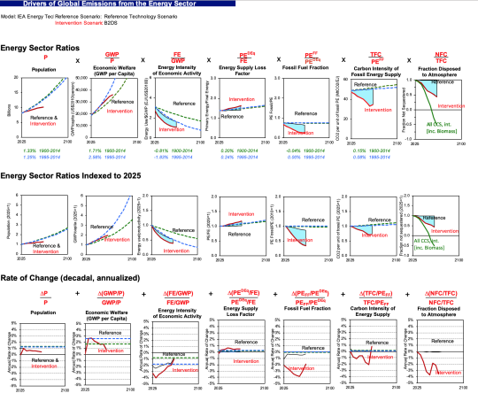
Discussion of Figure 2 (Ratios)
The 2nd graph below shows the expanded Kaya identity ratios. Population is the same, but all the other columns show ratios from the 2nd equation above. Population and wealth per person (the first two terms in the Kaya identity) are the biggest drivers of emissions in the reference case, while the energy intensity of economic activity declines to offset some of the growth in the first two terms.
The ratio of final energy to GWP tracks trends since 1995 for the reference case, and declines more rapidly in the intervention case. Why the rate of decline should be so rapid in the early years and then decline to about -1% in later years is a question worth asking the modelers.
As expected from the discussion above, the energy supply loss factor suggests losses are roughly constant in the reference case and grow in the intervention case. The fossil fuel fraction declines substantially over the analysis period, as does the carbon intensity of fossil energy supply. Interestingly, there’s a step change in the rates of change for the carbon intensity of energy supply in the final years of the forecast, and it would be interesting to know from the modelers why this comes about.
The last column shows the extent of carbon sequestration as well as carbon sequestration from biomass. This column is measured as a fraction of total fossil carbon emitted, so some of the drop in this ratio is associated with declining absolute amounts of fossil carbon over time. Nevertheless, this graph indicates substantial use of carbon sequestration (both conventional and biomass related) in this scenario.
This example illustrates the use of our decomposition dashboards for the 2017 IEA Beyond 2 Degrees scenario (B2DS). We will do a similar exercise for the 2019 WEO results that are soon to be released.
References
1. Koomey, Jonathan, Zachary Schmidt, Holmes Hummel, and John Weyant. 2019. “Inside the Black Box: Understanding Key Drivers of Global Emission Scenarios.” Environmental Modeling and Software. vol. 111, no. 1. January. pp. 268-281. [https://www.sciencedirect.com/science/article/pii/S1364815218300793]
Before our article was published we examined comparable historical energy balance data from the International Energy Agency to see what it could tell us. The IEA global energy balances don’t go back as far as the PFU data, but are more detailed in some ways. This post describes the high level results from that review.
First, let’s look at an equation known as the Kaya Identity, which describes fossil carbon emissions as the product of four terms: Population, GDP/person (wealth), Primary Energy/GDP, and Carbon dioxide emissions/primary energy.
Over time, analysts have realized that this four-factor identity collapses some important information. That’s why, in our 2019 article, we moved to the expanded Kaya identity, with several more terms:
The components of this identity are as follows:
CFossil Fuels represents carbon dioxide (CO2) emissions from fossil fuels combusted in the energy sector,
P is population,
GWP is gross world product (measured consistently using Purchasing Power Parity here),
FE is final energy,
PE is total primary energy, calculated using the direct equivalent (DEq) method (electricity from non-combustion resources is measured in primary energy terms as the heat value of the electricity to first approximation),
PEFF is primary energy associated with fossil fuels,
TFC is total fossil CO2 emitted by the primary energy resource mix,
NFC is net fossil CO2 emitted to the atmosphere after accounting for fossil sequestration.
For historical data, there is no sequestration of carbon dioxide emissions, so the last term is dropped in our graphs below.
Note that this identity applies only to carbon dioxide emissions from the energy sector. We use an additional additive dashboard for future scenarios to describe industrial process emissions, land use changes, and effects of other greenhouse gases, but we haven’t yet compiled those additional data for historical analysis and we only present the graphs for energy sector total fossil carbon dioxide emissions here.
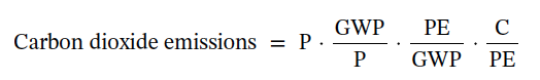
The first graph is what we call our graph of key factors, from the indented list above. In the first row we show each term in its raw form. The second row shows indices with 1971 = 1.0. And the last term shows the annual rate of change in each term.
The total fossil carbon is the end result of the other factors, which drive emissions. It grows by about a factor of two from 1971 to 2016.
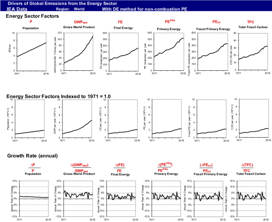
The 2nd graph below shows the expanded Kaya identity ratios. Population is the same, but all the other columns show ratios from the 2nd equation above. Population and wealth per person (the first two terms in the Kaya identity) are the biggest drivers of emissions, while the energy intensity of economic activity declines to offset some of the growth in the first two terms. The other terms don’t show much change over the past 45 years.
Quantitatively, population and GWP per person both roughly double, while energy intensity of economic activity drops by half, with other factors roughly constant. That is consistent with Total Fossil Carbon increasing by a factor of two over this period.
These graphs are a handy summary of key historical data from IEA. If you want to see the longer term trends from IIASA’s PFU data, please email me and I’ll send you a copy of our 2019 article, which has those graphs. Happy to share the spreadsheets + graphs for those interested.
References
1. Koomey, Jonathan, Zachary Schmidt, Holmes Hummel, and John Weyant. 2019. “Inside the Black Box: Understanding Key Drivers of Global Emission Scenarios.” Environmental Modeling and Software. vol. 111, no. 1. January. pp. 268-281. [https://www.sciencedirect.com/science/article/pii/S1364815218300793]
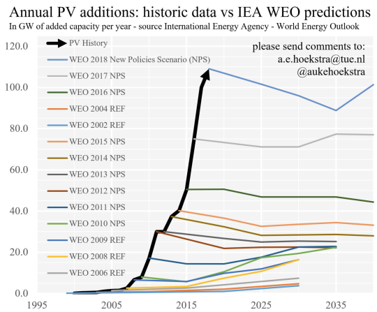
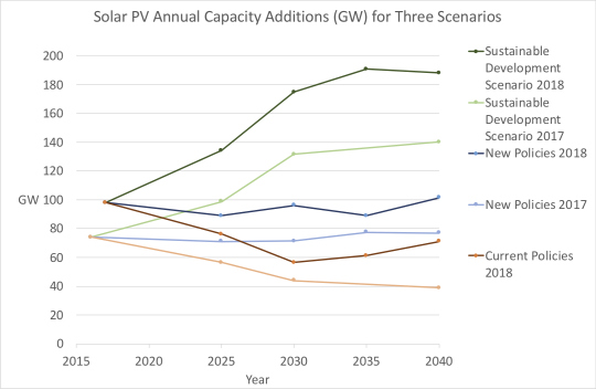
My colleague @AukeHoekstra (on Twitter) has for several years produced a graph of the International Energy Agency’s (IEA’s) projections of global photovoltaic (PV) installations. The graph has become iconic. Auke documents his methods here.
The graph shows that IEA’s projections in their “New Polices Scenario” indicate that annual installations of PVs will stay constant at current historical levels. Every year as actual shipments grow rapidly, IEA ramps up its starting point to reflect historical data, but never seems to adjust the projection’s general trend after the first year of the projection.
This is a puzzling graph to those of us who understand historical technology trends for mass produced products like PVs. In this post, I’ll explore briefly why I think so.
First, it’s important to understand IEA’s terminology for their annual World Energy Outlook (WEO). Their “New Policies Scenario” is one in which current policies continue and then are renewed when they would otherwise have expired. It’s a way to characterize a more or less constant policy environment. They also show a “Current Policies Scenario” in which existing policies exist until their expiration date, and then they disappear. They also have a Sustainable Development Scenario in which more aggressive policies are assumed to be implemented than in the New Policies Scenario.
I asked my colleague Zach to plot PV installations for these three scenarios for the WEO 2017 and 2018. The graph below shows the results.
The difference between the Current Policies Scenario and the New Policies Scenario is the expected effect of renewing current policies when they would have otherwise expired. In the 2017 WEO, there’s almost a doubling in annual installations by 2040 in going from Current to New Policies. It’s more like a 50% increase for the 2018 WEO. In both cases, there’s about a doubling in annual installations by 2040 to go from New Policies to the Sustainable Development scenario.
The lesson I take from this is that WEO assumes that policy is the main (and perhaps sole) driver of penetration of renewables. This is odd for those who understand learning rates for mass produced technologies. When the cumulative production of a mass produced device doubles, its cost per unit declines by a more or less predictable amount. For PVs, that cost decline is 20-25% per doubling of cumulative production historically.
Why wouldn’t penetration of PVs increase if annual installations stayed in the 100 GW range for two decades? Cost per unit would come down significantly in such a scenario, so there’s a real inconsistency here that needs further investigation.
It’s also counterintuitive that exponential growth in annual sales of PVs would immediately be followed by zero growth in annual sales forever more. The idea, I think, is that the growth is policy driven, so that if you don’t accelerate the policies then there won’t be any more growth. But if historical growth is solely policy driven, why wouldn’t that growth continue as it has for the past decade if you maintain current policies? It’s another contradiction in the logic of the projections.
One possible explanation is that IEA’s model may have arbitrary internal constraints that prevent variable renewables from penetrating the market more than a certain fraction to reflect the complexities of integrating these technologies into current electricity grids. It is not clear why these constraints should kick in immediately once a scenario starts. They clearly haven’t been affecting growth much so far!
Unfortunately, those constraints are rarely reflective of actual constraints in the real world. Most models have such constraints, but they say more about the modelers’ limited understanding of power systems and renewables than they do about actual constraints. We will increasingly need to examine and abandon those arbitrary modeling constraints as the penetration of variable renewables increases.
For those who want a detailed historical example of arbitrary constraints in a widely used energy model, see our 1999 Lawrence Berkeley National Laboratory (LBNL) report on wind energy in the Energy Information Administration’s National Energy Modeling System (NEMS) [1]. As I recall, we found three levels of arbitrary penetration constraints in NEMS that prevented wind adoption even when our scenarios included high carbon taxes.
Something is clearly amiss with IEA’s projections for PV adoption, and I would be very surprised if similar issues don’t exist for wind and electricity storage. In a time of rapid technological change, it isn’t wise to rely on things staying static. The only thing constant is change!
References
1. Osborn, Julie, Frances Wood, Cooper Richey, Sandy Sanders, Walter Short, and Jonathan G. Koomey. 2001. A Sensitivity Analysis of the Treatment of Wind Energy in the AEO99 Version of NEMS. Berkeley, CA: Ernest Orlando Lawrence Berkeley National Laboratory and the National Renewable Energy Laboratory. LBNL-44070. January. [https://emp.lbl.gov/publications/sensitivity-analysis-treatment-wind]
Here is the key paragraph (in the context of ways information technology (IT) can promote efficiency):
IT also helps users manage data more effectively, particularly when data are released in a standardized format. For example, electric utility rates, which are now almost exclusively printed on paper, are difficult to manage for large companies with facilities in many states. The rates are complicated and they vary state-by-state and over time in unpredictable ways. If the federal government were to promote the development of a standardized electronic format for utility rates it would allow greater efficiencies in the design and energy management of facilities owned by multi-state and multi-national companies. The Lawrence Berkeley National Laboratory tariff analysis project made a first pass at creating a database of such tariffs manually <https://energyanalysis.lbl.gov/publications/tariff-analysis-project-database-and>, but that’s a far cry from having such data released and updated automatically by each utility. A nice side effect of such standardization would be that web-based energy analysis tools could more easily evaluate utility bills for residential and smaller commercial customers as well.
And here’s the bullet point recommending action:
Second, the U.S. Department of Energy and the Federal Energy Regulatory Commission should be asked to assess the benefits and costs of promoting standardized electronic formats for utility rates.
Here’s how I described the benefits of this idea in a summary I wrote after the hearing:
The benefits of enabling such customer comparisons would be substantial. Utility customers would save billions by choosing the tariffs most beneficial to them. Utilities would face new pressure to rationalize their tariffs and align them with actual costs. The implications of discriminatory tariffs that inhibit adoption of new electricity technologies would become immediately apparent, and thus adoption of alternative generation and efficiency technologies would be accelerated. Finally, non-utility companies devoted to offering energy services at lowest total cost would gain a powerful new tool to help their customers.
Senator Jeff Bingaman approached me after the hearing about this idea and put me in touch with his staff person in charge of these issues (Alicia Jackson). I wrote up a few pages describing the idea and how to move forward. Ms. Jackson eventually drafted legislative language that made its way into one of the big energy policy bills then being considered.
Senator Bingaman is not in the Senate anymore and the big bill was never passed, but I remain convinced that this is an idea that could make a real difference. Key links are below.
My short writeup of the idea: “A proposal for standardized metadata formats for retail utility tariffs that will promote economic productivity, energy efficiency, and technological innovation”. PDF. Microsoft Word 2016.
The 1 page draft legislative language in its most advanced form. PDF. Microsoft Word 2016.
The Open EI project has an updated database of utility rates, but like all efforts before it, this database was created by scraping rate data from utility PDFs.
Whenever sanity returns to DC someone should take up this idea and run with it. I’m happy to share my thoughts with anyone who wants to take on this challenge.
In August 2011, I summarized our experience in retrofitting old downlights with new LEDs. We installed fifty of these beauties at $50/fixture (including free installation because they were so easy for the contractor to install). These avoided having to spend $20 to replace each dingy old fixture, so the economics were pretty good to start with.
One of the fixtures failed quickly, and it was swapped out for a new one. Since 2011 (i.e. 8 years) I’ve had to buy four more replacements (including the one I just purchased for my home office, which is used much more than other fixtures in the house).
The cool thing about LEDs is that they are on the electronics learning curve rather than the old industrial sector learning curve, so costs come down quickly. A better version of the device that cost $50 in 2011 now costs $22.36 on Amazon. The new version weighs 206 g instead of 484 grams for the original one (a 57% reduction), and it’s significantly smaller in volume. It looks like the body has been constructed of fewer pieces, which may explain part of the cost reduction.
Progress in electronics continues to amaze and astonish, but there’s a bigger lesson: energy efficiency is a renewable resource. It gets cheaper and better over time!
As I’ve done for the past couple of years, I appeared again on Chris Nelder’s Transition Show podcast anniversary show. Here’s how he summarized the episode:
In this anniversary episode, we welcome back Jonathan Koomey to talk about some of the interesting developments and raucous debates we have seen over the past year.
A favorite quotation of mine from the episode:
The rule is we need to reduce emissions as much as possible as fast as possible starting immediately. That’s it. You don’t need to see any more studies.
And another favorite quotation:
We can envision the world we want to create and by our choices, we can create that world.
One of the best things about the Transition Show is that it brings in real experts to talk about complicated issues. It’s the closest thing you can get to a primary source on the key issues of the day in energy transitions, short of reading the actual articles. Subscribe if you can!
Writing in New York Magazine, @EricLevitz explains the real issues with the terrible article by Franzen in the New Yorker (”Jonathan Franzen’s Climate Pessimism Is Justified. His Fatalism Is Not”). As part of his article, he summarizes with accuracy and nuance the true challenge we face regarding climate in this long but wonderful paragraph:
“We have already burned an unsafe amount of carbon, and nothing we do now is likely to prevent the climate from growing evermore inhospitable for the rest of our lives. We cannot know with certainty quite how much ecological devastation we’ve already bought ourselves, or exactly how much carbon we can burn without triggering mass starvation, civilizational collapse, or human extinction. Those 1.5- and two-degree warming targets you’ve heard so much about are informed by science, but they’re still inescapably arbitrary. Keeping warming below 1.5 degrees won’t be sufficient to prevent wrenching ecological disruptions (some of which will be tantamount to “end of the world” for those most severely afflicted). And at the rate we’re going, we almost certainly not going to keep warming below even two degrees, anyway. A better climate (than our current one) is not possible; at least, not for us, or our children, or their children. But the faster we decarbonize the global economy, the better our chances of sparing the world’s most vulnerable communities from near-term destruction — and our civilization from medium-term collapse — will be.”
Read it carefully. It’s the real deal.
Addendum: We can still keep warming below 2C (or even 1.5C) but it will require us to reduce emissions as fast as possible and as much as possible, starting immediately. Whether we will or not is up to us.
Addendum 2: Dr. Kate Marvel concisely nails it here, writing in Scientific American (“Shut Up, Franzen”): “Climate change is real and things will get worse—but because we understand the driver of potential doom, it’s a choice, not a foregone conclusion”
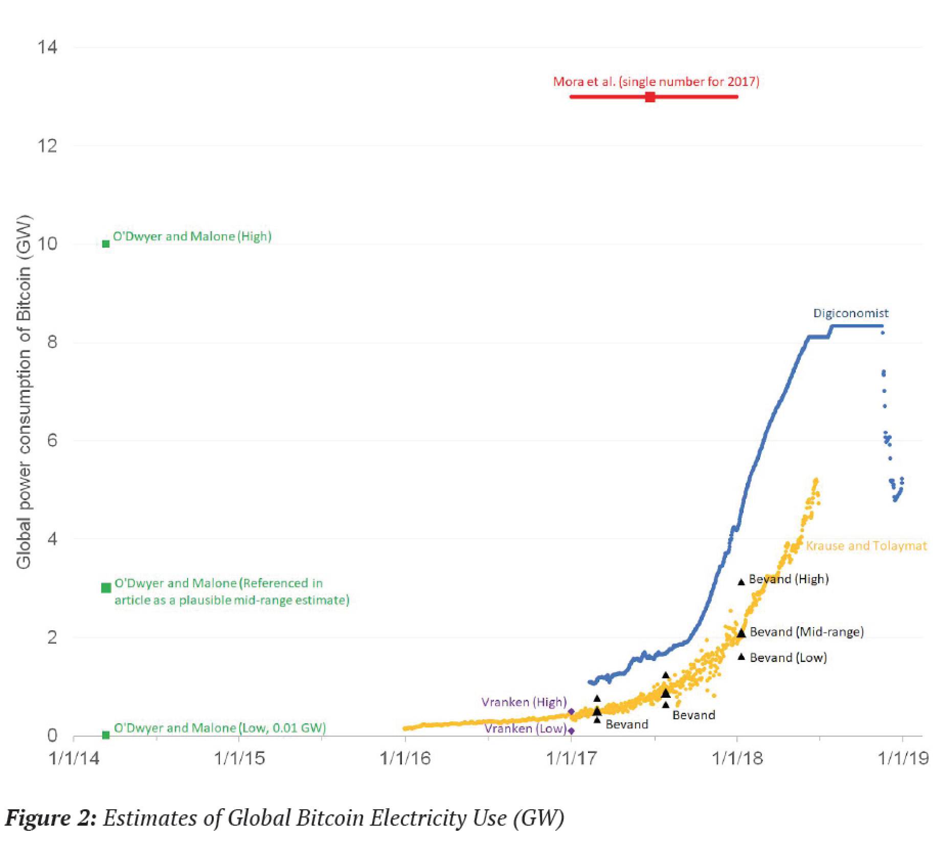
The rapid emergence of Bitcoin and other cryptocurrencies has taken many in the energy sector by surprise. This report summarizes complexities and pitfalls in analyzing the electricity demand of new information technology, focusing on Bitcoin, the mostly widely used cryptocurrency. It also gives best practices for analyses in this space, and reviews recent estimates in light of those best practices. Things change rapidly for cryptocurrency, so special care (such as including an exact date for each estimate) is needed in describing the results of such analyses.
The most reliable estimates of Bitcoin electricity use for June 30, 2018 total about 0.2% of global electricity consumption. Because of the collapse in Bitcoin prices in the latter half of 2018, some estimates indicate that this total has begun to decline, though nobody knows if that trend will continue.
Future studies of cryptocurrency electricity use can avoid the pitfalls identified in this report by following some simple rules, which the report describes in more detail:
• Report estimates to the day
• Provide complete and accurate documentation
• Avoid guesses and rough estimates about underlying data
• Collect bottom-up measured data in the field for both components and systems
• Properly address locational variations in siting of mining facilities
• Explicitly and completely assess uncertainties
• Avoid extrapolating into the future
Studies that don’t follow these best practices should be viewed with skepticism.
The key graph (Figure 2) is here:
There are three current credible estimates for Bitcoin electricity use (Vranken, Bevand, and Krause and Tolaymat). Their estimates are consistent with each other and are based on transparent and sensible data and assumptions. The other three estimates I reviewed (Digiconomist, Mora et al, and O’Dwyer and Malone) all have serious issues.
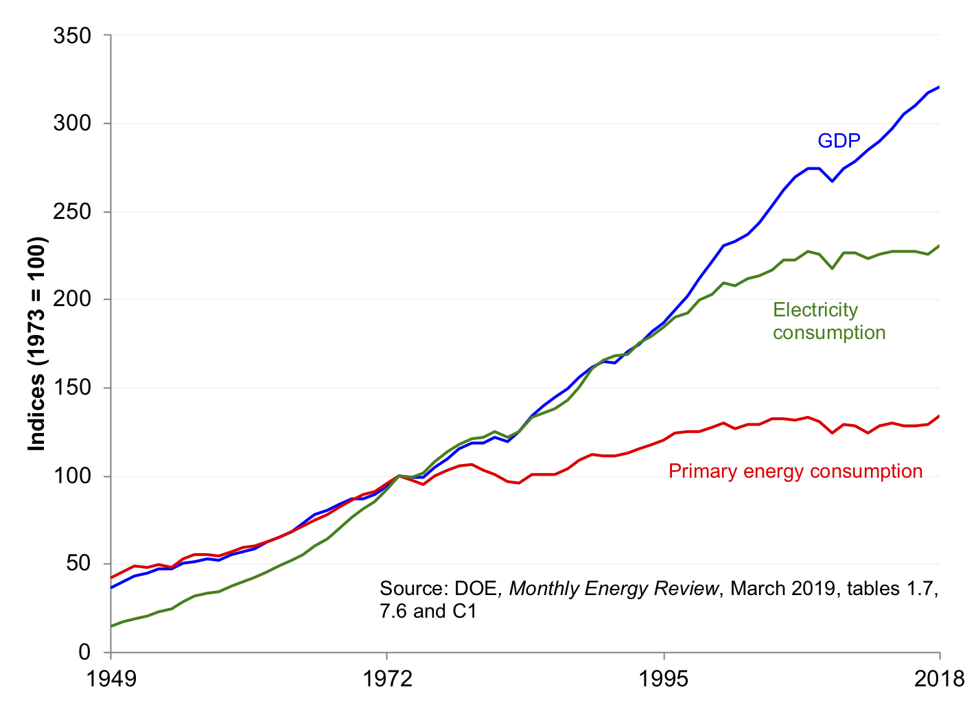
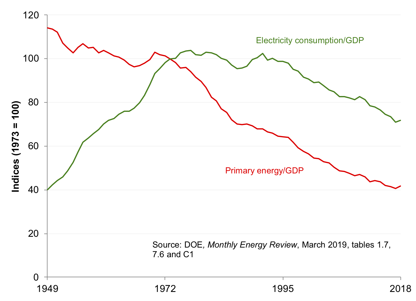
Back in 2015, Professor Richard Hirsh (Virginia Tech) and I published the following article in The Electricity Journal, documenting trends in US primary energy, electricity, and real (inflation-adjusted) Gross Domestic Product (GDP) through 2014:
Hirsh, Richard F., and Jonathan G. Koomey. 2015. “Electricity Consumption and Economic Growth: A New Relationship with Significant Consequences?” The Electricity Journal. vol. 28, no. 9. November. pp. 72-84. [http://www.sciencedirect.com/science/article/pii/S1040619015002067]
Every year since, my colleage Zach Schmidt and I have updated the trend numbers for the US using the latest energy and electricity data from the US Energy Information Administration (EIA). The GDP numbers are preliminary, from the US Bureau of Economic Analysis (released 3/28/2019) This short blog post gives the three key graphs from that study updated to 2018, and makes a few observations.
Figure 1 shows GDP, primary energy, and electricity consumption through 2018. From 2017 to 2018, GDP grew a little more slowly and primary energy and electricity grew a little more rapidly than in recent years, resulting in slight changes in the slope of those curves. The overall picture, though, hasn’t changed that much, and we’ll have to see what happens in subsequent years. Electricity consumption and primary energy consumption have been flat for about a decade and two decades (respectively).
Figure 2 shows the ratio of primary energy and electricity consumption to GDP. The trends there are pretty clear as well. Primary energy use per unit of GDP has been declining since the early 1970s, while the ratio of electricity use to GDP has been declining since the mid 1990s. Before the 1970s, electricity intensity of economic activity was increasing, and from the early 1970s to the mid 1990s, it was roughly constant.
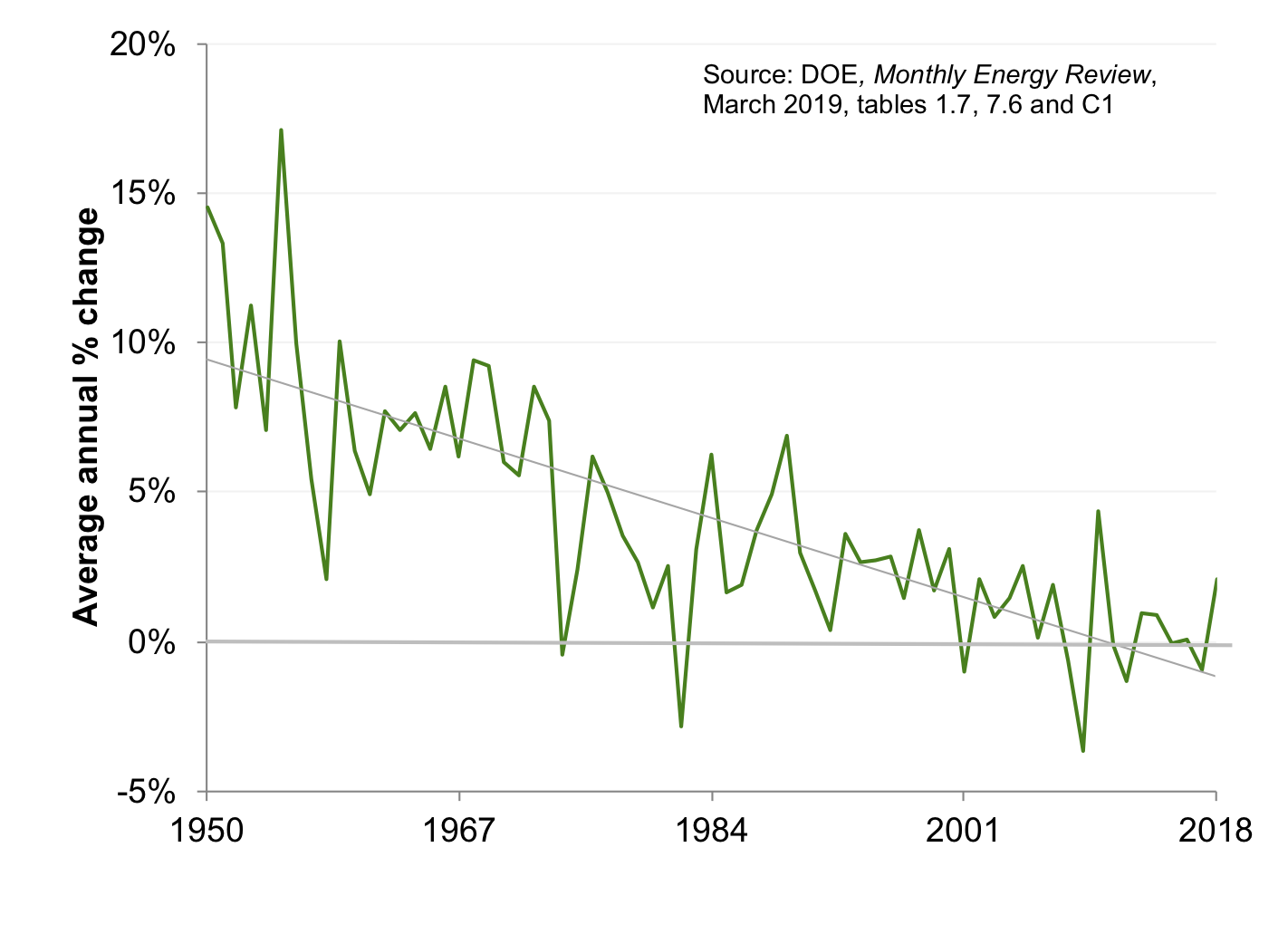
Figure 3 (which was Figure 4 in the Hirsh and Koomey article) shows the annual change in electricity consumption going back to 1950. Growth in total US electricity consumption has just about stopped in the past decade, but there’s significant year-to-year variation. Flat consumption poses big challenges to utilities, whose business models depend on continued growth to increase profits (unless they are in states like California, where the regulators have decoupled electricity use from profits).
Email me at jon@koomey.com if you’d like a copy of the 2015 article or the latest spreadsheet with graphs. If you want to use these graphs, you are free to do so as long as you don’t change the data and you credit the work as follows:
This graph is an updated version of one that appeared in Hirsh and Koomey (2015), using data from the US Energy Information Administration and the US Bureau of Economic Analysis.
Hirsh, Richard F., and Jonathan G. Koomey. 2015. “Electricity Consumption and Economic Growth: A New Relationship with Significant Consequences?" The Electricity Journal. vol. 28, no. 9. November. pp. 72-84. [http://www.sciencedirect.com/science/article/pii/S1040619015002067]


