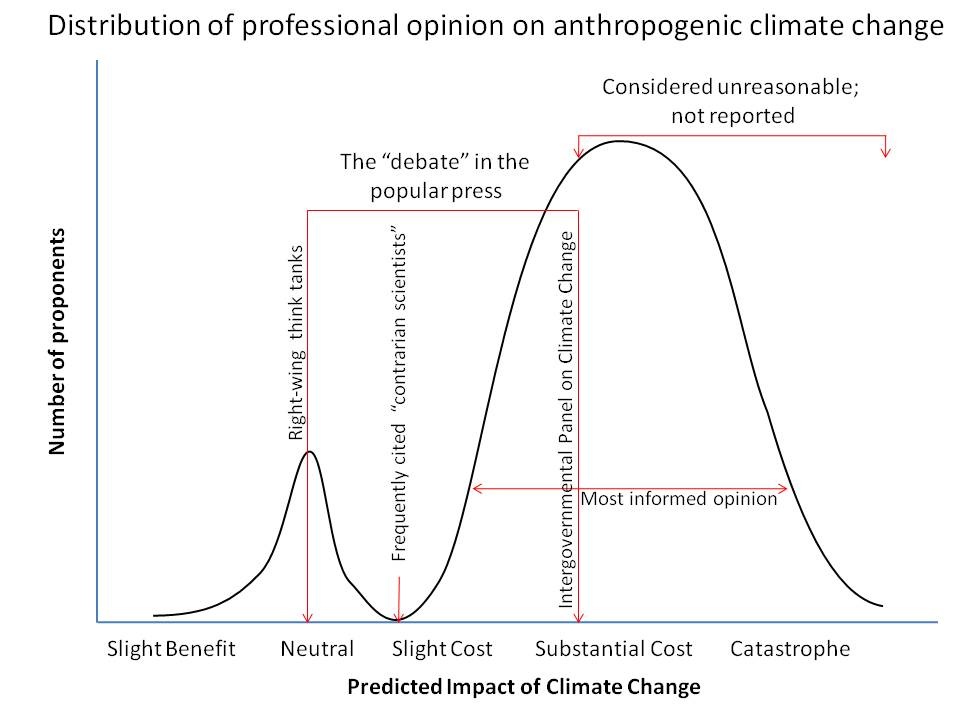
A brilliant graph summarizing the communications quandary about climate change
Michael Tobis (with help from Stephen Ban) posted a wonderful schematic graph back in January 2012 contrasting the state of media coverage about climate with what informed opinion actually says. It’s not intended to be quantitatively accurate, but I think it conveys things pretty well, based on my experience in following this issue over the past couple of decades. Here’s the graph:

Joe Romm, over at Climate Progress, has used this graph effectively to discuss the issue of false balance in media reporting. If you talk about what the literature says about the path we’re now on (5 degrees C warming by 2100, as I discuss in Cold Cash, Cool Climate) you’re labeled by the mainstream media folks as an “alarmist”. But what if the truth is really alarming? I’m sure dinosaurs who raised the issue of a possible meteor strike were labeled alarmists also (I’m being facetious, folks), but that didn’t help most of those critters to survive that particular disaster when it happened.
Reality doesn’t care about what we think is plausible, and the more society ignores reality as best scientists understand it, the more likely it is that we’ll misjudge, with potentially catastrophic consequences for humanity and the earth’s natural systems.
