A highly political example of lying with charts

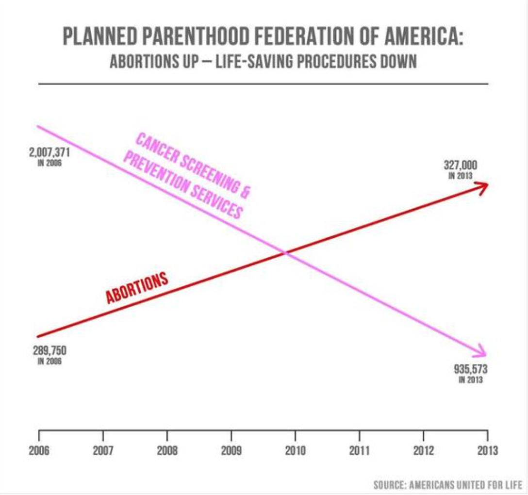
At hearings yesterday about Planned Parenthood, Rep. Jason Chaffetz (R-UT) put up the chart above. This tweet gives the apparent source of the graph, which is an anti-abortion organization. Abortion is of course a highly charged issue, and feelings run high, but there is no excuse for making a chart that misleads so blatantly. Whoever made the graph just superimposed two different graphs with different Y axes, making it quantitatively meaningless and highly misleading.
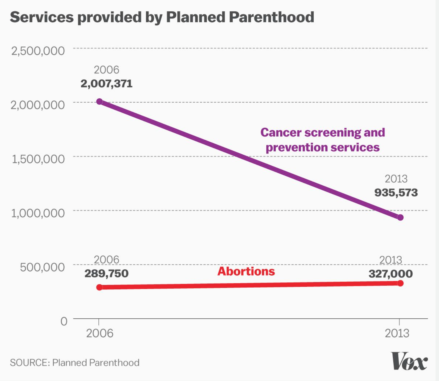
As Timothy B. Lee at Vox pointed out, the correct way to make such a graph is here:

The 2nd graph tells a very different (and accurate) story. Shame on whoever made the first graph, and shame on Representative Chaffetz for using it. That’s lying with graphs in a truly blatant manner.
Here’s the old classic book on this topic: How to Lie with Statistics
Also see two more recent resources, my own book Turning Numbers into Knowledge and Stephen Few’s book Show Me the Numbers.
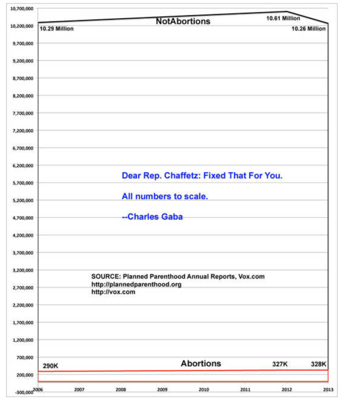
Update: Blogger Brainwrap at Daily Kos posted a different version of the graph that gives additional context, adding up all the various procedures performed by Planned Parenthood.

