If we don't change our direction, we'll end up where we're headed
Joe Romm of Climate Progress did a great service for climate communications on March 8th, 2013 by publishing this graph of historical and projected global temperatures:
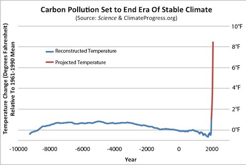
Figure 1: Historical and projected global average surface temperatures on our current trajectory for fossil fuel emissions
The historical data in the graph came from a recently published article in Science, and the projected data came from the “no-policy” case developed by the folks at MIT back in 2009. The MIT case showed about a 5 Celsius degree increase in global average surface temperatures by 2100, equivalent to about a 9 Fahrenheit degree increase.
I like this graph because it combines what we know about historical temperatures with what is our most likely future–one where we continue to consume fossil fuels at increasing rates. I realized after seeing Joe’s graph that I could easily add additional context to it, because I have both historical data on carbon dioxide concentrations in the atmosphere, as well as the detailed projections from the MIT researchers (which I obtained from them while working on my most recent book, Cold Cash, Cool Climate: Science-based Advice for Ecological Entrepreneurs).
Here’s Figure 2-3 from Cold Cash, Cool Climate, updated to include CO2 concentrations through 2012. It shows historical carbon dioxide concentrations for the past 450,000 years, including the strikingly rapid increase since the 1800s. The early historical data come from the Vostok and Lawdome ice cores, while the more recent data (post 1959) come from direct measurements. We’ve pushed carbon dioxide concentrations well outside the range that has prevailed over the past 450 millennia.
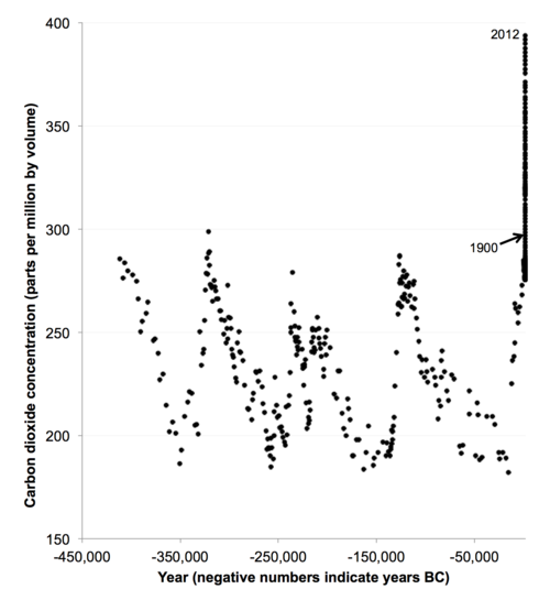
Figure 2: Carbon dioxide concentrations for the past 450,000 years
The data for the past 12,000 years, the period over which human civilization developed, shows a picture similar to Romm’s graph of temperatures. Carbon dioxide concentrations were relatively stable for the entirety of this period, slightly increasing over time, with the most rapid increase only happening as the industrial revolution accelerated in the 1800s.
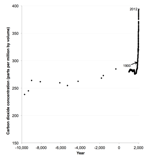
Figure 3: Carbon dioxide concentrations for the past 12,000 years
Of course, carbon dioxide concentrations are not the only determinant of global surface temperatures, so the concentrations graph won’t exactly match Romm’s temperature graph, but the fact that concentrations didn’t change much over 10,000 years is consistent with that graph.
The issue of most concern to people thinking sensibly about climate is not the historical change in carbon dioxide concentrations, but the likely trajectory of those concentrations if we continue on the path we’re on now. I’ve modified Figure 3 to include the MIT projections to 2100 to show just how big the change in carbon dioxide concentrations is likely to be (note that the y-axis in Figure 4 starts at 100 ppm, not 0 ppm). We’re on track for a threefold increase in the concentration of carbon dioxide by 2100 if our emissions proceed along the path expected by MIT’s no policy case.
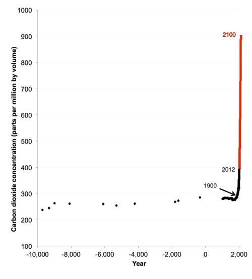
Figure 4: Carbon dioxide concentrations for the past 12,000 years and projected to 2100 assuming no change in policies
The picture is even more striking when compared to the past 450,000 years (Figure 5), showing that we’re moving the earth well out of the comfortable range in which humanity evolved and civilization developed.
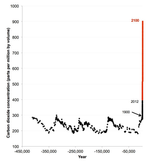
Figure 5: Carbon dioxide concentrations for the past 450,000 years and projected to 2100 assuming no change in policies
Of course, it’s not just carbon dioxide that matters. If you include the other important warming agents (like methane, nitrous oxides, CFCs and others) the MIT no policy case shows even bigger changes. Figure 6 modifies Figure 4 to include these other agents in the projection, expressed as carbon dioxide equivalent concentrations. Such conversions are complex and imperfect, but they’re good enough to get an order of magnitude estimate of the total potential impact of the path we’re now on.
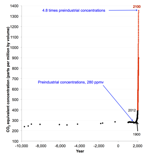
Figure 6: Carbon dioxide concentrations for the past 12,000 years and projected to 2100 assuming no change in policies, including other warming gases
Here’s the same graph going back 450,000 years (Figure 7).
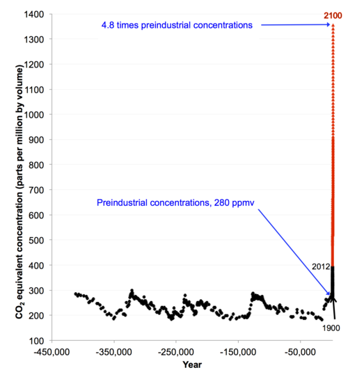
Figure 7: Carbon dioxide concentrations for the past 450,000 years and projected to 2100 assuming no change in policies, including other warming gases
The critical takeaway from Figures 6 and 7 is that we’re on track for more than two doublings of greenhouse gas concentrations by 2100 if we continue on our current path (greenhouse gas equivalent concentrations rise by a factor of 4.8 by 2100). Many in the media and elsewhere mistakenly focus only on the climate sensitivity, which is the expected increase in global average surface temperatures for a doubling of greenhouse gas equivalent concentrations (best estimate now is about 3 Celsius degrees, or 5.4 Fahrenheit degrees, per doubling). But it’s not just the temperature increase from a doubling of concentrations that matters, you also need to know how many doublings we’re in for!
I’ve been frustrated for many years by the way numbers about projected greenhouse gas concentrations have been presented, even by some folks who ought to know better. The most common approach has been to focus just on carbon dioxide, and make some hand-waving statements about the effects of the other warming agents, but that never satisfied me. As a comparison of Figure 4 and Figure 6 show, the other warming agents are significant contributors to warming, increasing the effective greenhouse gas concentration from about 900 ppm (for carbon dioxide alone) to about 1350 ppm when all warming agents are included.
The MIT researchers deserve great credit for their work. They appropriately defined a “no-policy” case to clearly show the effect of the current path we’re on (avoiding the confusion among policy makers engendered by the “multiple baselines” approach embodied in the IPCC Fourth Assessment report). They also conducted a comprehensive analysis of all warming agents, and made their data available to other researchers who could summarize the results in effective ways. It was quite a relief to discover their work, and it made writing the first few chapters of Cold Cash, Cool Climate a lot easier.
The last part of the puzzle is to understand whether the MIT no-policy case is a plausible representation of a world in which we initiate no constraints on greenhouse gas emissions. One way to do that is to compare the history for various drivers of emissions (like population, energy efficiency, and economic growth) to the projections, a task that I undertook in Chapter 2 of Cold Cash, Cool Climate. In virtually every case, the projected trends looked a lot like the previous 50 years, and in some cases, the projections showed more modest growth than one might expect from recent history.
Another way to assess the projection is to examine just how many fossil fuel resources exist, to see if it’s plausible that the world could burn the amount of fossil fuels embodied in the MIT no policy case. I conducted this exercise in Chapter 2 and Appendix A of Cold Cash, Cool Climate. I also summarized the results in my blog post titled “Why fossil fuel abundance is an illusion” (see Figure 8).
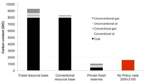
Figure 8: Lower bound estimates of fossil fuel reserves compared to fossil carbon emissions in the MIT’s no-policy case
The key conclusion from this analysis (which is based on lower-bound resource estimates taken from the most recent Global Energy Assessment) is that fossil fuel resource constraints are unlikely to constrain carbon emissions in the twenty first century. If we just burn the conventional oil and gas resource base plus the coal proven reserves, we’d only need to burn about 10% of the remaining coal in the “resource base” to hit the MIT no-policy case emissions by 2100. In a world where the true cost of fossil fuels is masked by subsidies and unpriced pollution costs, it is clear to me that we’d easily burn enough fossil fuels to match the no-policy case totals.
Conclusions
The case for concern about rising greenhouse gas (GHG) concentrations is ironclad, and the graphics above show one compelling way to describe that case. We’re on track for more than two doublings of greenhouse gas concentrations by 2100 when all warming agents are included. Combined with an expected warming of about 3 Celsius degrees per doubling of GHG concentrations (the climate sensitivity) that implies about a 6 Celsius degree warming commitment on our current path (the 5 Celsius degree warming calculated by MIT for 2100 is lower because it takes many centuries for the climate to equilibrate to fully account for the effects of changes in concentrations).
The graphs above show a dramatic shift in the climate system caused by human activity, one that has no precedent in human history. We need to leave more than three-quarters of proven fossil fuel reserves in the ground if we’re to stabilize the climate (for more technical backup on this point, see this classic paper by Meinshausen et al. and the technical details provided in Cold Cash, Cool Climate). It’s hard to imagine a starker challenge for humanity, but it’s one that we must confront if we’re to leave a livable world for our descendants.
