If you think the climate hasn't warmed since 1998, think again
One of the most common Internet memes about climate is the idea that the earth hasn’t warmed since 1998. This erroneous claim is based on cherry picking data and ignoring the increase in the heat content of the oceans, which is where most of the historical warming has been stored. This issue is explored fully in this section of the website Skeptical Science, as well as another page that explores the right and wrong ways to understand trends, but I recently saw a nice graph that boils it all down.
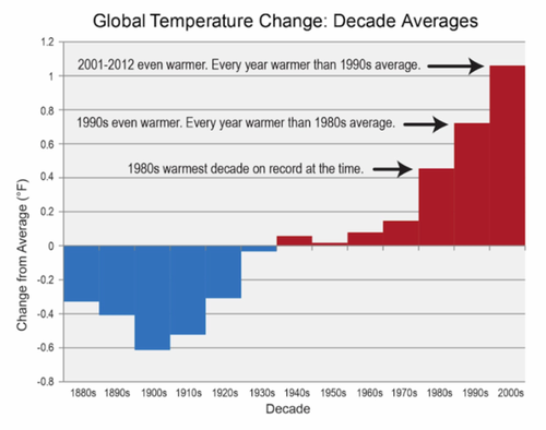
The graph was in the recently released National Climate Assessment, but it was on p. 796, in Appendix 4 (talk about burying the lede!). It shows average global surface temperatures by decade over time, indicating that the 2000s were hotter than the 1990s, which were hotter than the 1980s, which were hotter than the 1970s. It shows clearly to anyone who can read a graph why global warming didn’t stop in 1998. For those still perpetuating this falsehood, please find another hobby.

Figure caption: The last five decades have seen a progressive rise in Earth’s average surface temperature. Bars show the difference between each decade’s average temperature and the overall average for 1901 to 2000. The far right bar includes data for 2001-2012. (Figure source: NOAA NCDC). National Climate Assessment, p.796, Figure 7 in Appendix 4.
