Our summary of the driving forces behind the 2017 IEA “Beyond 2 degrees” (B2DS) scenario
There’s been discussion recently about the upcoming release of the 2019 International Energy Agency (IEA) scenarios related to the World Energy Outlook (WEO). We’ve worked in the past few months to disentangle the drivers for a key 2017 scenario, what IEA calls their “Beyond 2 degrees” (B2DS) scenario and I wanted to post these results so we’ll have something to which to compare when the 2019 scenarios are released. We express the results in what we call a “dashboard of key drivers” (see below).
The 2017 scenario is based on IEA’s Energy Technology Perspectives (ETP) model, which is different from the World Energy Outlook model. While the WEO comes out every year the ETP analyses come out at irregular intervals. You can read about both sets of analyses here.

For more background, see the post on IEA historical drivers of energy sector carbon dioxide emissions here. The reference for our 2019 article [1] upon which the decomposition analysis is based is at the end of this post. Email me for a PDF copy if you can’t get access otherwise. We also have an excel workbook all set up to do these decompositions and graphs, so let me know if you’d like a copy.
Let’s first look at an equation known as the Kaya Identity, which describes fossil carbon emissions as the product of four terms: Population, GDP/person (wealth), Primary Energy/GDP, and Carbon dioxide emissions/primary energy.

Over time, analysts have realized that this four-factor identity collapses some important information. That’s why, in our 2019 article, we moved to the expanded Kaya identity, with several more terms:

The components of this identity are as follows:
CFossil Fuels represents carbon dioxide (CO2) emissions from fossil fuels combusted in the energy sector,
P is population,
GWP is gross world product (measured consistently using Purchasing Power Parity here),
FE is final energy,
PE is total primary energy, calculated using the direct equivalent (DEq) method (electricity from non-combustion resources is measured in primary energy terms as the heat value of the electricity to first approximation),
PEFF is primary energy associated with fossil fuels,
TFC is total fossil CO2 emitted by the primary energy resource mix,
NFC is net fossil CO2 emitted to the atmosphere after accounting for fossil sequestration.
For historical data, there is no sequestration of carbon dioxide emissions, so the last term is dropped in the previous blog post, but included for future scenarios.
Note that this identity applies only to carbon dioxide emissions from the energy sector. We use an additional additive dashboard for future scenarios to describe industrial process emissions, land use changes, and effects of other greenhouse gases, but that one isn’t quite ready for prime time, so I’m focusing just on the energy sector here.
Discussion of Figure 1 (Factors)
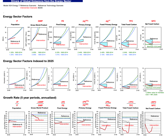
The first graph is what we call our graph of key factors, from the indented list above. In the first row we show each term in its raw form for both the reference case (in black) and the intervention case (in red). The second row shows indices with 2025 = 1.0. And the last term shows the annual rate of change in each term for reference and intervention cases. In each case, we plot historical trends from IIASA’s PFU database for each factor from 1900 to 2014 (in green dashed lines) and 1995 to 2014 (in blue dashed lines)
The total fossil carbon is the end result of the other factors, which drive emissions. It grows modestly from 2025 to 2060 (when the scenarios end). This was unexpected for me, and it suggests an area of fruitful inquiry (and comparison to other reference cases). I would have expected higher growth in emissions in a reference case.
Population doesn’t vary at all between reference and intervention scenarios, which is commonplace for such projections. Population is not seen as a lever for climate policy except in rare cases, mainly for ethical reasons. There may be policies (like educating and empowering women) that we should do for other reasons, but almost never are these considered as climate policies (and that’s appropriate, in my view).
Another observation about population emerges from these data also. Projected population growth to 2060 is much slower than historical trends. This result mainly comes from long term changes that almost all demographers agree are underway, and this picture of slowing population growth is almost universal in long run energy scenarios. Unlike the 1971 to 2016 period, when population was responsible for half of growth in energy sector GHGs, this driver will be far less important to emissions in the future.

Download higher resolution version of Energy Sector Factors for B2DS
Gross World Product (GWP) is another key driver, and that term is projected to increase by more than a factor of two by 2060 in both the reference and intervention cases.
Final energy (e.g., energy consumption measured at the building meter or the customer’s gas tank) is projected to grow modestly in the reference case and decline modestly in the intervention case. Same for primary energy. Both grow much more slowly than historical trends, which is another interesting area of investigation.
Fossil primary energy is roughly constant in the reference case and declines substantially in the intervention case. Same for total fossil carbon and net fossil carbon. Note the green line in the last column for the top two rows, where we plot the contribution of biomass CCS to net emissions reductions in the intervention case for comparison. Though these net emissions savings are often counted outside of the energy sector, they are linked to the energy sector and it’s useful to show their magnitude here for comparison.
The last row of the dashboard shows annual rates of change, which reveal some interesting trends and suggests further investigations. Population grows at a modest and mostly steady rate after 2030. GWP growth slows substantially for reference and intervention cases from 2025 onwards. Why should that be?
Final energy in the reference case shows modest but declining annual growth rates, while the Intervention case averages about zero growth over the analysis period. It’s not clear why final energy use should grow in the later years of the projection.
Primary energy growth rates decline for the reference case and increase for the intervention case. This means that there are more conversion losses in the energy system over time in the intervention case (because final energy growth rates are mostly negative during the forecast period for the intervention case).
Fossil primary energy growth is modest over the reference case, but is strongly negative (about -3%/year) for the first couple of decades of the analysis period. Then the negative growth moderates, for reasons that are unclear. Annual growth rates for total fossil carbon and net fossil carbon show the same “V” shape as fossil primary energy, and that’s a prime area of investigation. Why, in an aggressive mitigation case, would mitigation efforts let up at the end? It’s possible that the last bits of mitigation would get harder, but aggressive mitigation would drive costs down fast, and it’s an open question as to which of these factors would prevail in an aggressive mitigation case.
Discussion of Figure 2 (Ratios)
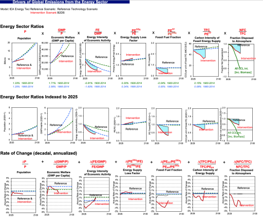
The 2nd graph below shows the expanded Kaya identity ratios. Population is the same, but all the other columns show ratios from the 2nd equation above. Population and wealth per person (the first two terms in the Kaya identity) are the biggest drivers of emissions in the reference case, while the energy intensity of economic activity declines to offset some of the growth in the first two terms.

Download higher resolution version of Energy Sector Ratios for B2DS
The ratio of final energy to GWP tracks trends since 1995 for the reference case, and declines more rapidly in the intervention case. Why the rate of decline should be so rapid in the early years and then decline to about -1% in later years is a question worth asking the modelers.
As expected from the discussion above, the energy supply loss factor suggests losses are roughly constant in the reference case and grow in the intervention case. The fossil fuel fraction declines substantially over the analysis period, as does the carbon intensity of fossil energy supply. Interestingly, there’s a step change in the rates of change for the carbon intensity of energy supply in the final years of the forecast, and it would be interesting to know from the modelers why this comes about.
The last column shows the extent of carbon sequestration as well as carbon sequestration from biomass. This column is measured as a fraction of total fossil carbon emitted, so some of the drop in this ratio is associated with declining absolute amounts of fossil carbon over time. Nevertheless, this graph indicates substantial use of carbon sequestration (both conventional and biomass related) in this scenario.
This example illustrates the use of our decomposition dashboards for the 2017 IEA Beyond 2 Degrees scenario (B2DS). We will do a similar exercise for the 2019 WEO results that are soon to be released.
References
1. Koomey, Jonathan, Zachary Schmidt, Holmes Hummel, and John Weyant. 2019. “Inside the Black Box: Understanding Key Drivers of Global Emission Scenarios.” Environmental Modeling and Software. vol. 111, no. 1. January. pp. 268-281. [https://www.sciencedirect.com/science/article/pii/S1364815218300793]
