Why climate change causes BIG increases in extreme weather
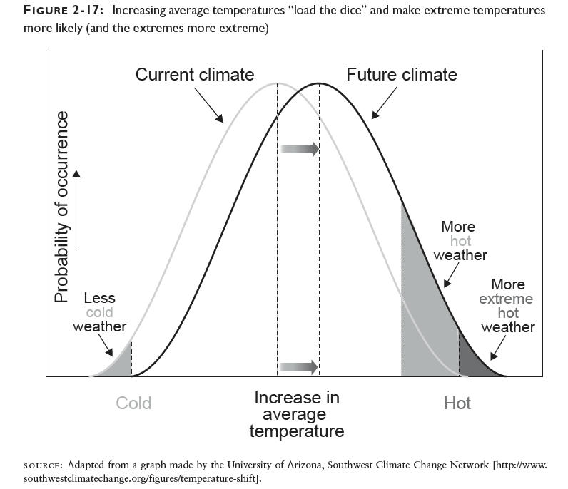
Jim Hansen just published a terrific summary of the past few decades of temperature measurements, and it shows the stark reality: increasing the average temperature even a modest amount substantially increases the chances of extreme temperature events.
I showed this result conceptually in Figure 2-17 of Cold Cash, Cool Climate using a graph from the University of Arizona’s Southwest Climate Change Network:

Now, Hansen has calculated the actual distributions by decade to show what’s really been happening, and the results are striking. The overall summary is in his Figure 2:

Figure 2. Temperature anomaly distribution: The frequency of occurrence (vertical axis) of local temperature anomalies (relative to 1951-1980 mean) in units of local standard deviation (horizontal axis). Area under each curve is unity. Image credit: NASA/GISS. JK note added Aug. 14, 2012: the horizontal axis is NOT in units of temperature but in terms of standard deviations from the mean. For a normal distribution, which these graphs appear to be, about 68% of all the occurrences would be found within one standard deviation from the mean, and 95% of them would be within two standard deviations. When I figure out how to convert these results to temperature I’ll post again.
Figure 3 breaks down the distributions by decade, and compares them to the 1951-1980 average:

Figure 3. Frequency of occurrence (vertical axis) of local June-July-August temperature anomalies (relative to 1951-1980 mean) for Northern Hemisphere land in units of local standard deviation (horizontal axis). Temperature anomalies in the period 1951-1980 match closely the normal distribution (“bell curve”, shown in green), which is used to define cold (blue), typical (white) and hot (red) seasons, each with probability 33.3%. The distribution of anomalies has shifted to the right as a consequence of the global warming of the past three decades such that cool summers now cover only half of one side of a six-sided die, white covers one side, red covers four sides, and an extremely hot (red-brown) anomaly covers half of one side. Image credit: NASA/GISS.
The interesting thing about these results is that the distribution not only shifts to the right, but it also flattens out and spreads over a broader area. The extreme heat events increase very substantially compared to the 1951-1980 average, and this trend is only going to get worse unless we take serious action to reduce emissions.
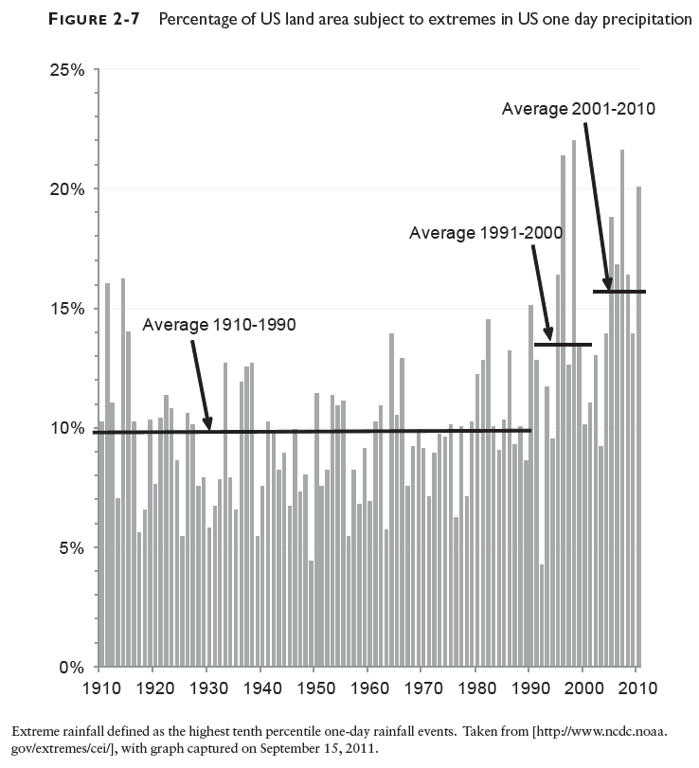
The same basic conclusion holds for precipitation extremes also, though I haven’t seen those data plotted in this exact way. Figure 2-7 in Cold Cash, Cool Climate shows how precipitation extremes for the US have increased in the past two decades:

These are actual measurements showing how the climate is changing. So if you believe in reality, you need to heed what the measurements are telling us. We need to reduce greenhouse gas emissions, and to do so in short order, otherwise we’re in for a whole lot more extreme weather like the summer of 2012, and I’m pretty sure that’s not something anyone wants to repeat.
